Theoretical Paper
- Computer Organization
- Data Structure
- Digital Electronics
- Object Oriented Programming
- Discrete Mathematics
- Graph Theory
- Operating Systems
- Software Engineering
- Computer Graphics
- Database Management System
- Operation Research
- Computer Networking
- Image Processing
- Internet Technologies
- Micro Processor
- E-Commerce & ERP
- Dart Programming
- Flutter Tutorial
- Numerical Methods Tutorials
- Flutter Tutorials
Practical Paper
Industrial Training

Flutter Text
A Text is a widget in Flutter that allows us to display a string of text with a single line in our application. Depending on the layout constraints, we can break the string across multiple lines or might all be displayed on the same line. If we do not specify any styling to the text widget, it will use the closest DefaultTextStyle class style. This class does not have any explicit style. In this article, we are going to learn how to use a Text widget and how to style it in our application.
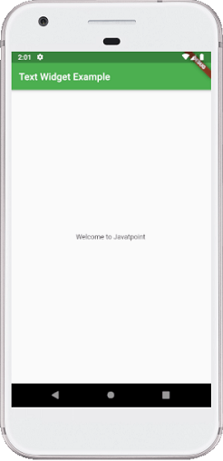
Here is a simple example to understand this widget. This example shows our project's title in the application bar and a message in the application's body.
import 'package:flutter/material.dart';

void main() { runApp(MyApp()); }

class MyApp extends StatelessWidget {
  @override
  Widget build(BuildContext context) {
    return MaterialApp(
        theme: ThemeData(
          primarySwatch: Colors.green,
        ),
        home: MyTextPage()
    );
  }
}
class MyTextPage extends StatelessWidget {
  @override
  Widget build(BuildContext context) {
    return Scaffold(
      appBar: AppBar(
          title:Text("Text Widget Example")
      ),
      body: Center(
          child:Text("Welcome to Javatpoint")
      ),
    );
  }
}
In the above code, we have used a MaterialApp widget that calls the home screen using the MyTextPage() class. This class contains the scaffold widget, which has appBar and body where we have used the Text widget to display the title and body, respectively. It is a simple scenario of Text widget where we have to pass the string that we want to display on our page.
When we run this application in the emulator or device, we should get the UI similar to the below screenshot:
Text Widget Constructor:
The text widget constructor used to make the custom look and feel of our text in Flutter:
const Text(String data,{
    Key key,
    TextStyle style,
    StrutStyle strutStyle,
    TextAlign textAlign,
    TextDirection textDirection,
    TextOverflow overflow,
    bool softWrap,
    double textScaleFactor,
    int maxLines,
    String semanticsLabel,
    TextWidthBasis textWidthBasis,
    TextHeightBehavior textHeightBehavior
    }
)
The following are the essential properties of the Text widget used in our application:
TextAlign: It is used to specify how our text is aligned horizontally. It also controls the text location.
TextDirection: It is used to determine how textAlign values control the layout of our text. Usually, we write text from left to right, but we can change it using this parameter.
Overflow: It is used to determine when the text will not fit in the available space. It means we have specified more text than the available space.
TextScaleFactor: It is used to determine the scaling to the text displayed by the Text widget. Suppose we have specified the text scale factor as 1.5, then our text will be 50 percent larger than the specified font size.
SoftWrap: It is used to determine whether or not to show all text widget content when there is not enough space available. If it is true, it will show all content. Otherwise, it will not show all content.
MaxLines: It is used to determine the maximum number of lines displayed in the text widget.
TextWidthBasis: It is used to control how the text width is defined.
TextHeightBehavior: It is used to control how the paragraph appears between the first line and descent of the last line.
Style: It is the most common property of this widget that allows developers to styling their text. It can do styling by specifying the foreground and background color, font size, font weight, letter and word spacing, locale, shadows, etc. See the table to understand it more easily:
| Attributes | Descriptions |
| foreground | It determines the paint as a foreground for the text. |
| background | It determines the paint as a background for the text. |
| fontWeight | It determines the thickness of the text. |
| fontSize | It determines the size of the text. |
| fontFamily | It is used to specify the typeface for the font. For this, we need to download a typeface file in our project, and then keep this file into the assets/font folder. Finally, config the pubspec.yaml file to use it in the project. |
| fontStyle | It is used to style the font either in bold or italic form. |
| Color | It is used to determine the color of the text. |
| letterSpacing | It is used to determine the distance between the characters of the text. |
| wordSpacing | It is used to specify the distance between two words of the text. |
| shadows | It is used to paint underneath the text. |
| decoration | We use this to decorate text using the three parameters: decoration, decorationColor, decorationStyle. The decoration determines the location, decorationColor specify the color, decorationStyle determine the shape. |
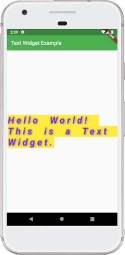
import 'package:flutter/material.dart';

void main() { runApp(MyApp()); }

class MyApp extends StatelessWidget {
  @override
  Widget build(BuildContext context) {
    return MaterialApp(
        theme: ThemeData(
          primarySwatch: Colors.green,
        ),
        home: MyTextPage()
    );
  }
}
class MyTextPage extends StatelessWidget {
  @override
  Widget build(BuildContext context) {
    return Scaffold(
      appBar: AppBar(
          title:Text("Text Widget Example")
      ),
      body: Center(
          child:Text(
            "Hello World! This is a Text Widget.",
            style: TextStyle(
              fontSize: 35,
              color: Colors.purple,
              fontWeight: FontWeight.w700,
              fontStyle: FontStyle.italic,
              letterSpacing: 8,
              wordSpacing: 20,
              backgroundColor: Colors.yellow,
              shadows: [
                Shadow(color: Colors.blueAccent, offset: Offset(2,1), blurRadius:10)
              ]
            ),
          )
      ),
    );
  }
}
Output:
When we run this application in the emulator or device, we should get the UI similar to the below screenshot:
Flutter RichText Widget
Sometimes we want to show a line or a paragraph with multiple styles such as bold, italicized, underlined, different color, different font or everything at once. In that case, we should have to use the RichText widget that allows us to perform multiple test styles without switching many widgets.
RichText is a very useful widget in Flutter, which is used for displaying a paragraph of text on the UI with multiple styles. Inside the widget, we can have different styles by giving it a tree of TextSpan widgets. Each TextSpan can set its own style for overriding the default style.
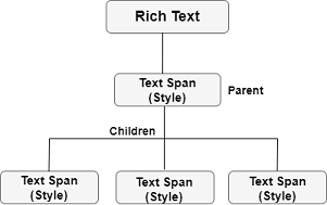
RichText Structure
The below image explains the structure of the RichText widget. In this image, the parent TextSpan has its own style property and a text parameter, and then it can contain several children TextSpan who have their own style property.
From the above overview, now we will see how to use this widget in our application.
Example
Suppose our app has a login screen and an option to create a new user account. The creation of new user account section has a combination of regular text and colored text, as shown in the below screen:
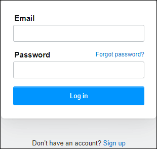
In the above image, we can see the text "Don't have an account? Sign up" is a single line text, where the last part is a clickable word that navigates the user on the sign-up page. To make this type of text, we will divide it into two parts. The first part uses the parent TextSpan and input the text "Don't have an account?" with the black color. The second part uses the children TextSpan and input the text "Sign up" with a blue color. See the below code:
RichText(
    text: TextSpan(
        text: 'Don\'t have an account?',
        style: TextStyle(color: Colors.black, fontSize: 20),
        children: < TextSpan>[
            TextSpan(text: ' Sign up',
                style: TextStyle(color: Colors.blueAccent, fontSize: 20)
            )
        ]
    ),
),
Since the "Sign up" is a clickable text, so we need to implement onTap() action on this part. The TextSpan contains TapGestureRecognizer() that implement onTap() action. In our example, we will use the recognizer property to make the text tappable. Let us show the entire code snippet to understand it more clearly.
Create a new project in the IDE you are using. Open the project, navigate to the lib folder, and replace the below code with the main.dart file.
import 'package:flutter/material.dart';
import 'package:flutter/gestures.dart';

void main() { runApp(MyApp()); }

class MyApp extends StatelessWidget {
  @override
  Widget build(BuildContext context) {
    return MaterialApp(
        theme: ThemeData(
          primarySwatch: Colors.green,
        ),
        home: MyTextPage()
    );
  }
}
class MyTextPage extends StatelessWidget {
  @override
  Widget build(BuildContext context) {
    return Scaffold(
      appBar: AppBar(
          title:Text("Rich Text Widget Example")
      ),
      body: Container(
          child: Center(
            child: RichText(
              text: TextSpan(
                  text: 'Don\'t have an account?',
                  style: TextStyle(color: Colors.black, fontSize: 20),
                  children: < TextSpan>[
                    TextSpan(text: ' Sign up',
                        style: TextStyle(color: Colors.blueAccent, fontSize: 20),
                        recognizer: TapGestureRecognizer()
                          ..onTap = () {}
                    )
                  ]
              ),
            ),
          )
      )
    );
  }
}
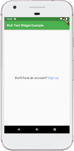
Output:
When we run this application in the emulator or device, we should get the UI similar to the below screenshot:
How to show an icon in a text widget in Flutter?
Sometimes the developers need to show an icon with the text widget. To do this, Flutter provides a WidgetSpan() inside the RichText() widget to add an icon with the text widget. The below example explains it in a simple way:
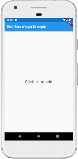
import 'package:flutter/material.dart';

void main() { runApp(MyApp()); }

class MyApp extends StatelessWidget {
  @override
  Widget build(BuildContext context) {
    return MaterialApp(
        home: MyTextPage()
    );
  }
}
class MyTextPage extends StatelessWidget {
  @override
  Widget build(BuildContext context) {
    return Scaffold(
      appBar: AppBar(
          title:Text("Rich Text Widget Example")
      ),
      body: Container(
          child: Center(
            child:RichText(
              text: TextSpan(
                style: Theme.of(context).textTheme.body1,
                children: [
                  TextSpan(text: 'Click ', style: TextStyle(fontSize: 25)),
                  WidgetSpan(
                    child: Padding(
                      padding: const EdgeInsets.symmetric(horizontal: 2.0),
                      child: Icon(Icons.add, color: Colors.red),
                    ),
                  ),
                  TextSpan(text: ' to add', style: TextStyle(fontSize: 25)),
                ],
              ),
            )
          )
      )
    );
  }
}
Output:
When we run this application in the emulator or device, we should get the UI similar to the below screenshot: