Theoretical Paper
- Computer Organization
- Data Structure
- Digital Electronics
- Object Oriented Programming
- Discrete Mathematics
- Graph Theory
- Operating Systems
- Software Engineering
- Computer Graphics
- Database Management System
- Operation Research
- Computer Networking
- Image Processing
- Internet Technologies
- Micro Processor
- E-Commerce & ERP
- Dart Programming
- Flutter Tutorial
- Numerical Methods Tutorials
Practical Paper
Industrial Training

Flutter - Introduction to Widgets
As we learned in the earlier chapter, widgets are everything in Flutter framework. We have already learned how to create new widgets in previous chapters.
In this chapter, let us understand the actual concept behind creating the widgets and the different type of widgets available in Flutter framework.
Let us check the Hello World application’s MyHomePage widget. The code for this purpose is as given below −
class MyHomePage extends StatelessWidget {
   MyHomePage({Key key, this.title}) : super(key: key);

   final String title;
   @override
   Widget build(BuildContext context) {
      return Scaffold(
         appBar: AppBar(title: Text(this.title), ),
         body: Center(child: Text( 'Hello World',)),
      );
   }
}
Here, we have created a new widget by extending StatelessWidget.
Note that the StatelessWidget only requires a single method build to be implemented in its derived class. The build method gets the context environment necessary to build the widgets through BuildContext parameter and returns the widget it builds.
In the code, we have used title as one of the constructor argument and also used Key as another argument. The title is used to display the title and Key is used to identify the widget in the build environment.
Here, the build method calls the build method of Scaffold, which in turn calls the build method of AppBar and Center to build its user interface.
Finally, Center build method calls Text build method.
For a better understanding, the visual representation of the same is given below −
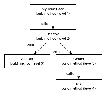
Widget Build Visualization
In Flutter, widgets can be grouped into multiple categories based on their features, as listed below −
Platform specific widgets
Layout widgets
State maintenance widgets
Platform independent / basic widgets
Let us discuss each of them in detail now.
Platform specific widgets
Flutter has widgets specific to a particular platform - Android or iOS.
Android specific widgets are designed in accordance with Material design guideline by Android OS. Android specific widgets are called as Material widgets.
iOS specific widgets are designed in accordance with Human Interface Guidelines by Apple and they are called as Cupertino widgets.
Some of the most used material widgets are as follows −
Scaffold
AppBar
BottomNavigationBar
TabBar
TabBarView
ListTile
RaisedButton
FloatingActionButton
FlatButton
IconButton
DropdownButton
PopupMenuButton
ButtonBar
TextField
Checkbox
Radio
Switch
Slider
Date & Time Pickers
SimpleDialog
AlertDialog
Some of the most used Cupertino widgets are as follows −
CupertinoButton
CupertinoPicker
CupertinoDatePicker
CupertinoTimerPicker
CupertinoNavigationBar
CupertinoTabBar
CupertinoTabScaffold
CupertinoTabView
CupertinoTextField
CupertinoDialog
CupertinoDialogAction
CupertinoFullscreenDialogTransition
CupertinoPageScaffold
CupertinoPageTransition
CupertinoActionSheet
CupertinoActivityIndicator
CupertinoAlertDialog
CupertinoPopupSurface
CupertinoSlider
Layout widgets
In Flutter, a widget can be created by composing one or more widgets. To compose multiple widgets into a single widget, Flutter provides large number of widgets with layout feature. For example, the child widget can be centered using Center widget.
Some of the popular layout widgets are as follows −
Container − A rectangular box decorated using BoxDecoration widgets with background, border and shadow.
Center − Center its child widget.
Row − Arrange its children in the horizontal direction.
Column − Arrange its children in the vertical direction.
Stack − Arrange one above the another.
We will check the layout widgets in detail in the upcoming Introduction to layout widgets chapter.
State maintenance widgets
In Flutter, all widgets are either derived from StatelessWidget or StatefulWidget.
Widget derived from StatelessWidget does not have any state information but it may contain widget derived from StatefulWidget. The dynamic nature of the application is through interactive behavior of the widgets and the state changes during interaction. For example, tapping a counter button will increase / decrease the internal state of the counter by one and reactive nature of the Flutter widget will auto re-render the widget using new state information.
We will learn the concept of StatefulWidget widgets in detail in the upcoming State management chapter.
Platform independent / basic widgets
Flutter provides large number of basic widgets to create simple as well as complex user interface in a platform independent manner. Let us see some of the basic widgets in this chapter.
Text
Text widget is used to display a piece of string. The style of the string can be set by using style property and TextStyle class. The sample code for this purpose is as follows −
Text('Hello World!', style: TextStyle(fontWeight: FontWeight.bold))
Text widget has a special constructor, Text.rich, which accepts the child of type TextSpan to specify the string with different style. TextSpan widget is recursive in nature and it accepts TextSpan as its children. The sample code for this purpose is as follows −
Text.rich(
   TextSpan(
      children: [
         TextSpan(text: "Hello ", style:
         TextStyle(fontStyle: FontStyle.italic)),
         TextSpan(text: "World", style:
         TextStyle(fontWeight: FontWeight.bold)),
      ],
   ),
)
The most important properties of the Text widget are as follows −
maxLines, int− Maximum number of lines to show
overflow, TextOverFlow − Specify how visual overflow is handled using TextOverFlow class
style, TextStyle − Specify the style of the string using TextStyle class
textAlign, TextAlign − Alignment of the text like right, left, justify, etc., using TextAlign class
textDirection, TextDirection − Direction of text to flow, either left-to-right or right-to-left
Image
Image widget is used to display an image in the application. Image widget provides different constructors to load images from multiple sources and they are as follows −
Image− Generic image loader using ImageProvider
Image.asset − Load image from flutter project’s assets
Image.file − Load image from system folder
Image.memory − Load image from memory
Image.Network − Load image from network
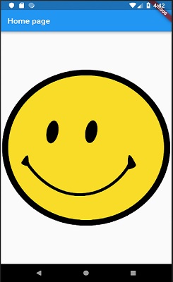
The easiest option to load and display an image in Flutter is by including the image as assets of the application and load it into the widget on demand.
Create a folder, assets in the project folder and place the necessary images.
Specify the assets in the pubspec.yaml as shown below −
flutter:
   assets:
      - assets/smiley.png
Now, load and display the image in the application.
Image.asset('assets/smiley.png')
The complete source code of MyHomePage widget of the hello world application and the result is as shown below −.
class MyHomePage extends StatelessWidget {
   MyHomePage({Key key, this.title}) : super(key: key);
   final String title;

   @override
   Widget build(BuildContext context) {
      return Scaffold(
         appBar: AppBar( title: Text(this.title), ),
         body: Center( child: Image.asset("assets/smiley.png")),
      );
   }
}
The loaded image is as shown below −
The most important properties of the Image widget are as follows −
image, ImageProvider − Actual image to load
width, double − Width of the image
height, double − Height of the image
alignment, AlignmentGeometry − How to align the image within its bounds
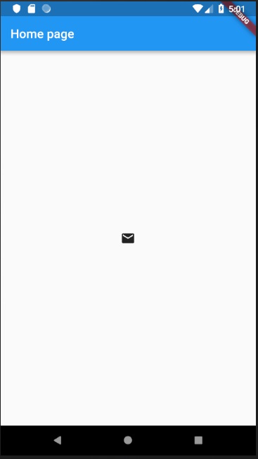
Icon
Icon widget is used to display a glyph from a font described in IconData class. The code to load a simple email icon is as follows −
Icon(Icons.email)
The complete source code to apply it in hello world application is as follows −
class MyHomePage extends StatelessWidget {
   MyHomePage({Key key, this.title}) : super(key: key);
   final String title;

   @override
   Widget build(BuildContext context) {
      return Scaffold(
         appBar: AppBar(title: Text(this.title),),
         body: Center( child: Icon(Icons.email)),
      );
   }
}
The loaded icon is as shown below −