Theoretical Paper
- Computer Organization
- Data Structure
- Digital Electronics
- Object Oriented Programming
- Discrete Mathematics
- Graph Theory
- Operating Systems
- Software Engineering
- Computer Graphics
- Database Management System
- Operation Research
- Computer Networking
- Image Processing
- Internet Technologies
- Micro Processor
- E-Commerce & ERP
- Dart Programming
- Flutter Tutorial
- Numerical Methods Tutorials
- Flutter Tutorials
Practical Paper
Industrial Training
Flutter Row and Column
In the previous sections, we have learned to create a simple Flutter application and its basic styling to the widgets. Now, we are going to learn how to arrange the widgets in rows and columns on the screen. The rows and columns are not a single widget; they are two different widgets, namely Row and Column. Here, we will integrate these two widgets together because they have similar properties that help us understand them efficiently and quickly.
Row and column are the two essential widgets in Flutter that allows developers to align children horizontally and vertically according to our needs. These widgets are very necessary when we design the application user interface in Flutter.
Key Points
- Row and Column widgets are the most commonly used layout patterns in the Flutter application.
- Both may take several child widgets.
- A child widget can also be a row or column widget.
- We can stretch or constrain a particular children's widget.
- Flutter also allows developers to specify how child widgets can use row and column widgets' available space.
Row Widget
This widget arranges its children in a horizontal direction on the screen. In other words, it will expect child widgets in a horizontal array. If the child widgets need to fill the available horizontal space, we must wrap the children widgets in an Expanded widget.
A row widget does not appear scrollable because it displays the widgets within the visible view. So it is considered wrong if we have more children in a row which will not fit in the available space. If we want to make a scrollable list of row widgets, we need to use the ListView widget.
We can control how a row widget aligns its children based on our choice using the property crossAxisAlignment and mainAxisAlignment. The row's cross-axis will run vertically, and the main axis will run horizontally. See the below visual representation to understand it more clearly.
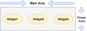
Note: Flutter row widget has several other properties like mainAxisSize, textDirection, verticalDirection, etc. Here, we will discuss only mainAxisAlignment and crossAxisAlignment properties.
We can align the row's children widget with the help of the following properties:
- start: It will place the children from the starting of the main axis.
- end: It will place the children at the end of the main axis.
- center: It will place the children in the middle of the main axis.
- spaceBetween: It will place the free space between the children evenly.
- spaceAround: It will place the free space between the children evenly and half of that space before and after the first and last children widget.
- spaceEvenly: It will place the free space between the children evenly and before and after the first and last children widget.
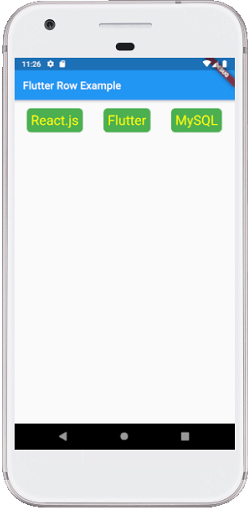
Let us understand it with the help of an example where we are going to align the content such that there is an even space around the children in a row:
import 'package:flutter/material.dart';

void main() { runApp(MyApp()); }
class MyApp extends StatelessWidget {
  @override
  Widget build(BuildContext context) {
    return MaterialApp(
      home: MyHomePage()
    );
  }
}

class MyHomePage extends StatefulWidget {
  @override
  _MyHomePageState createState() => _MyHomePageState();
}

class _MyHomePageState extends State< MyHomePage> {
  @override
  Widget build(BuildContext context) {
    return Scaffold(
      appBar: AppBar(
        title: Text("Flutter Row Example"),
      ),
      body: Row(
          mainAxisAlignment: MainAxisAlignment.spaceEvenly,
          children:< Widget>[
            Container(
              margin: EdgeInsets.all(12.0),
              padding: EdgeInsets.all(8.0),
              decoration:BoxDecoration(
                  borderRadius:BorderRadius.circular(8),
                  color:Colors.green
              ),
              child: Text("React.js",style: TextStyle(color:Colors.yellowAccent,fontSize:25),),
            ),
            Container(
              margin: EdgeInsets.all(15.0),
              padding: EdgeInsets.all(8.0),
              decoration:BoxDecoration(
                  borderRadius:BorderRadius.circular(8),
                  color:Colors.green
              ),
              child: Text("Flutter",style: TextStyle(color:Colors.yellowAccent,fontSize:25),),
            ),
            Container(
              margin: EdgeInsets.all(12.0),
              padding: EdgeInsets.all(8.0),
              decoration:BoxDecoration(
                  borderRadius:BorderRadius.circular(8),
                  color:Colors.green
              ),
              child: Text("MySQL",style: TextStyle(color:Colors.yellowAccent,fontSize:25),),
            )
          ]
      ),
    );
  }
}
Output:
When we run this app, we should get the UI as the below screenshot.
Column
This widget arranges its children in a vertical direction on the screen. In other words, it will expect a vertical array of children widgets. If the child widgets need to fill the available vertical space, we must wrap the children widgets in an Expanded widget.
A column widget does not appear scrollable because it displays the widgets within the visible view. So it is considered wrong if we have more children in a column which will not fit in the available space. If we want to make a scrollable list of column widgets, we need to use the ListView Widget.
We can also control how a column widget aligns its children using the property mainAxisAlignment and crossAxisAlignment. The column's cross-axis will run horizontally, and the main axis will run vertically. The below visual representation explains it more clearly.
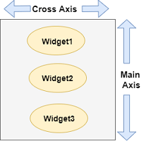
Note: Column widget also aligns its content by using the same properties as we have discussed in row widget such as start, end, center, spaceAround, spaceBetween, and spaceEvenly.
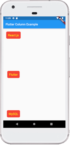
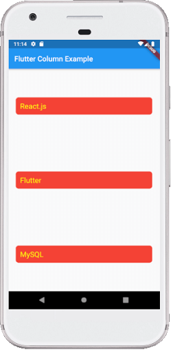
Let us understand it with the help of an example where we are going to align the content such that there is a free space between the children evenly in a column:
import 'package:flutter/material.dart';

void main() { runApp(MyApp()); }
class MyApp extends StatelessWidget {
  @override
  Widget build(BuildContext context) {
    return MaterialApp(
        home: MyHomePage()
    );
  }
}

class MyHomePage extends StatefulWidget {
  @override
  _MyHomePageState createState() => _MyHomePageState();
}

class _MyHomePageState extends State < MyHomePage> {
  @override
  Widget build(BuildContext context) {
    return Scaffold(
      appBar: AppBar(
        title: Text("Flutter Column Example"),
      ),
      body: Column(
          mainAxisAlignment: MainAxisAlignment.spaceBetween,
          children:< Widget>[
            Container(
              margin: EdgeInsets.all(20.0),
              padding: EdgeInsets.all(12.0),
              decoration:BoxDecoration(
                  borderRadius:BorderRadius.circular(8),
                  color:Colors.red
              ),
              child: Text("React.js",style: TextStyle(color:Colors.yellowAccent,fontSize:20),),
            ),
            Container(
              margin: EdgeInsets.all(20.0),
              padding: EdgeInsets.all(12.0),
              decoration:BoxDecoration(
                  borderRadius:BorderRadius.circular(8),
                  color:Colors.red
              ),
              child: Text("Flutter",style: TextStyle(color:Colors.yellowAccent,fontSize:20),),
            ),
            Container(
              margin: EdgeInsets.all(20.0),
              padding: EdgeInsets.all(12.0),
              decoration:BoxDecoration(
                  borderRadius:BorderRadius.circular(8),
                  color:Colors.red
              ),
              child: Text("MySQL",style: TextStyle(color:Colors.yellowAccent,fontSize:20),),
            )
          ]
      ),
    );
  }
}
Output:
When we run this app, we should get the UI as the below screenshot.
Flutter also allows developers to align the child widget with a combination of crossAxisAlignment and mainAxisAlignment for both row and column widget. Let us take the above example of column widget where we will set mainAxisAlignment as MainAxisAlignment.spaceAround and crossAxisAlignment is CrossAxisAlignment.stretch. It will make the height of the column is equal to the height of the body. See the below screenshot.
Drawbacks OF Row and Column Widget:
- Row widget in Flutter does not have horizontal scrolling. So if we have inserted a large number of children in a single row that cannot be fit in that row, we will see the Overflow message.
- Column widget in Flutter does not have vertical scrolling. So if we have inserted a large number of children in a single column whose total children size is not equal to the height of the screen, we will see the Overflow message.

