Theoretical Paper
- Computer Organization
- Data Structure
- Digital Electronics
- Object Oriented Programming
- Discrete Mathematics
- Graph Theory
- Operating Systems
- Software Engineering
- Computer Graphics
- Database Management System
- Operation Research
- Computer Networking
- Image Processing
- Internet Technologies
- Micro Processor
- E-Commerce & ERP
- Dart Programming
- Flutter Tutorial
- Numerical Methods Tutorials
- Flutter Tutorials
Practical Paper
Industrial Training

Flutter Switch
A switch is a two-state user interface element used to toggle between ON (Checked) or OFF (Unchecked) states. Typically, it is a button with a thumb slider where the user can drag back and forth to choose an option in the form of ON or OFF. Its working is similar to the house electricity switches. In Flutter, the switch is a widget used to select between two options, either ON or OFF. It does not maintain the state itself. To maintain the states, it will call the onChanged property. If the value return by this property is true, then the switch is ON and false when it is OFF. When this property is null, the switch widget is disabled. In this article, we are going to understand how to use a switch widget in the Flutter application.
Properties of Switch Widget
Some of the essential attributes of switch widget are given below:
| Attributes | Description |
| onChanged | It will be called whenever the user taps on the switch. |
| value | It contains a Boolean value true or false to control whether the switch functionality is ON or OFF. |
| activeColor | It is used to specify the color of the switch round ball when it is ON. |
| activeTrackColor | It specifies the switch track bar color. |
| inactiveThubmColor | It is used to specify the color of the switch round ball when it is OFF. |
| inactiveTrackColor | It specifies the switch track bar color when it is OFF. |
| dragStartBehavior | It handled the drag start behavior. If we set it as DragStartBehavior.start, the drag moves the switch from on to off. |
Example
In this application, we have defined a switch widget. Every time we toggled the switch widget, the onChanged property is called with a new state of the switch as value. To store the switch state, we have defined a boolean variable isSwitched that can be shown in the below code.
Open the IDE you are using, and create a Flutter application. Next, open the lib folder and replace main.dart with the following code.
import 'package:flutter/material.dart';

void main() => runApp(MyApp());

class MyApp extends StatelessWidget {
  @override
  Widget build(BuildContext context) {
    return MaterialApp(
        home: Scaffold(
            appBar: AppBar(
              backgroundColor: Colors.blue,
              title: Text("Flutter Switch Example"),
            ),
            body: Center(
                  child: SwitchScreen()
            ),
        )
    );
  }
}

class SwitchScreen extends StatefulWidget {
  @override
  SwitchClass createState() => new SwitchClass();
}

class SwitchClass extends State {
  bool isSwitched = false;
  var textValue = 'Switch is OFF';

  void toggleSwitch(bool value) {

    if(isSwitched == false)
    {
      setState(() {
        isSwitched = true;
        textValue = 'Switch Button is ON';
      });
      print('Switch Button is ON');
    }
    else
    {
      setState(() {
        isSwitched = false;
        textValue = 'Switch Button is OFF';
      });
      print('Switch Button is OFF');
    }
  }
  @override
  Widget build(BuildContext context) {
    return Column(
        mainAxisAlignment: MainAxisAlignment.center,
        children:[ Transform.scale(
            scale: 2,
            child: Switch(
              onChanged: toggleSwitch,
              value: isSwitched,
              activeColor: Colors.blue,
              activeTrackColor: Colors.yellow,
              inactiveThumbColor: Colors.redAccent,
              inactiveTrackColor: Colors.orange,
            )
          ),
          Text('$textValue', style: TextStyle(fontSize: 20),)
        ]);
  }
}
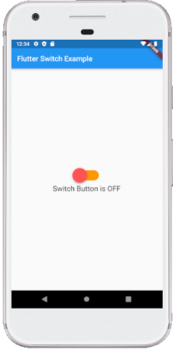
Output:
When we run the application in the emulator or device, we should get UI similar to the following screenshot
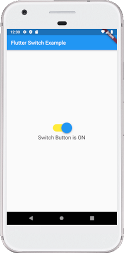
If we press on the switch, it will change their state from OFF to ON. See the below screenshot:
How to customize the Switch button in Flutter?
Flutter also allows the user to customize their switch button. Customization makes the user interface more interactive. We can do this by adding the custom-switch dependency in the pubspec.yaml file and then import it into the dart file.
Example
Open the main.dart file and replace it with the following code:
import 'package:flutter/material.dart';
import 'package:custom_switch/custom_switch.dart';

void main() => runApp(MyApp());

class MyApp extends StatelessWidget {
  @override
  Widget build(BuildContext context) {
    return MaterialApp(
        home: Scaffold(
            appBar: AppBar(
              backgroundColor: Colors.blue,
              title: Text("Custom Switch Example"),
            ),
            body: Center(
                  child: SwitchScreen()
            ),
        )
    );
  }
}

class SwitchScreen extends StatefulWidget {
  @override
  SwitchClass createState() => new SwitchClass();
}

class SwitchClass extends State {
  bool isSwitched = false;
  @override
  Widget build(BuildContext context) {
    return Column(
        mainAxisAlignment: MainAxisAlignment.center,
        children:< Widget>[
            CustomSwitch(
              value: isSwitched,
              activeColor: Colors.blue,
              onChanged: (value) {
                print("VALUE : $value");
                setState(() {
                  isSwitched = value;
                });
              },
            ),
          SizedBox(height: 15.0,),
          Text('Value : $isSwitched', style: TextStyle(color: Colors.red,
              fontSize: 25.0),)
        ]);
    }
}
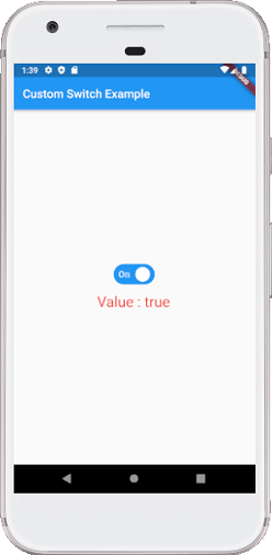
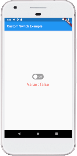
Output:
When we run the application in the emulator or device, we should get UI similar to the following screenshot:
If we press on the switch, it will change their state from OFF to ON. See the below screenshot: