Theoretical Paper
- Computer Organization
- Data Structure
- Digital Electronics
- Object Oriented Programming
- Discrete Mathematics
- Graph Theory
- Operating Systems
- Software Engineering
- Computer Graphics
- Database Management System
- Operation Research
- Computer Networking
- Image Processing
- Internet Technologies
- Micro Processor
- E-Commerce & ERP
- Dart Programming
- Flutter Tutorial
- Numerical Methods Tutorials
- Flutter Tutorials
Practical Paper
Industrial Training

Flutter Slider
A slider in Flutter is a material design widget used for selecting a range of values. It is an input widget where we can set a range of values by dragging or pressing on the desired position. In this article, we are going to show how to use the slider widget in Flutter in setting the range of values and how to customize the look of a slider.
Usually, we use the slider widget for changing a value. So, it is required to store the value in a variable. This widget has a slider class that requires the onChanged() function. This function will be called whenever we change the slider position.
A slider can be used for selecting a value from a continuous or discrete set of values. By default, it uses a continuous range of values. If we want to use discrete values, we must have to use a non-null value for divisions. This discrete division indicates the number of discrete intervals. Before getting the value, we have to set the minimum and maximum value. Slider provides min and max arguments to set the minimum and maximum limitations. For example, we have a set of values from 0.0 to 50.0, and divisions are 10, the slider would take values like 0.0, 10.0, 20.0, 30.0, 40.0, and 50.0.
Slider Properties
The following are the slider attributes used in Flutter. It has two required arguments, and all others are optional.
| Attributes | Type | Description |
| value | double | It is a required argument and used to specify the slider's current value. |
| onChanged | double | It is a required argument and called during dragging when the user selects a new value for the slider. If it is null, the slider is disabled. |
| onChangedStart | double | It is an optional argument and called when we start selecting a new value. |
| onChangedStart | double | It is an optional argument and called when we have done in selecting a new value for the slider. |
| max | double | It is an optional argument and determines the maximum value that can be used by the user. By default, it is 1.0. It should be greater than or equal to min. |
| min | double | It is an optional argument that determines the minimum value that can be used by the user. By default, it is 0.0. It should be less than or equal to max. |
| divisions | int | It determines the number of discrete divisions. If it is null, the slider is continuous. |
| label | string | It specifies the text label that will be shown above the slider. It displays the value of a discrete slider. |
| activeColor | class Color | It determines the color of the active portion of the slider track. |
| inactiveColor | class Color | It determines the color of the inactive portion of the slider track. |
| SemanticFormatterCallback | It is a callback that is used to create a semantic value. By default, it is a percentage. |
The slider in Flutter uses the following terms:
Thumb: It is a round shape that slides horizontally when we change values by dragging.
Track: It is a horizontal line where we can slide the thumb.
Overlay: It appears around the thumb while dragging.
Tick marks: It is used to mark the discrete values of a slider.
Value indicators: It will show the labels for the thumb values when we defined the labels.
Active: It is the active side of the slider, which is in between the thumb and the minimum value.
Inactive: It is the inactive side of the slider, which is in between the thumb and the maximum value.
How to use the slider widget in Flutter?
Here is the basic example of using a slider widget in Flutter.
Slider(
      min: 0,
      max: 100,
      value: _value,
      onChanged: (value) {
        setState(() {
          _value = value;
        });
      },
    ),
Example
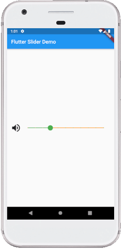
Let us understand how to use the slider in Flutter with the help of an example. In the following code, we had stored the value as an integer that must be cast to double first when it passed as a value argument and then rounded to integer inside the onChanged method. We have also specified the active portion of the slider as green, while the inactive portion is orange.
import  'package:flutter/material.dart';

void main() => runApp(MyApp());

// This Widget is the main application widget.
class MyApp extends StatelessWidget {
  @override
  Widget build(BuildContext context) {
    return MaterialApp(
      home: MySliderApp(),
    );
  }
}

class MySliderApp extends StatefulWidget {
  MySliderApp({Key key}) : super(key: key);

  @override
  _MySliderAppState createState() => _MySliderAppState();
}

class _MySliderAppState extends State< MySliderApp> {
  int _value = 6;
  @override
  Widget build(BuildContext context) {
    return Scaffold(
      appBar: AppBar(
        title: Text( 'Flutter Slider Demo'),
        ),
        body: Padding(
          padding: EdgeInsets.all(15.0),
            child: Center(
                child: Row(
                    mainAxisAlignment: MainAxisAlignment.spaceEvenly,
                    mainAxisSize: MainAxisSize.max,
                    children: [
                      Icon(
                        Icons.volume_up,
                        size: 40,
                      ),
                      new Expanded(
                          child: Slider(
                            value: _value.toDouble(),
                            min: 1.0,
                            max: 20.0,
                            divisions: 10,
                            activeColor: Colors.green,
                            inactiveColor: Colors.orange,
                            label:  'Set volume value',
                            onChanged: (double newValue) {
                              setState(() {
                                _value = newValue.round();
                                });
                              },
                              semanticFormatterCallback: (double newValue) {
                                return  '${newValue.round()} dollars';
                              }
                            )
                      ),
                    ]
                )
            ),
          )
      );
  }
}
Output:
When we run this app in the IDE, we should get the UI similar to the below screenshot. Here we can drag the slider to set the volume label.
Flutter Range Slider
It is a highly customizable component that selects a value from a range of values. It can be selected either from a continuous or discrete set of values.
Why Range Slider?
A slider component can provide single or multiple selections based on the continuous or discrete set of values. Here we must have to predetermine either a minimum or maximum value to adjust the selection in one direction. Unlike the slider, the range sliders allow two selection points that provide flexible adjustment to set the maximum and minimum value. This adjustment makes it a useful feature when we want to control a specific range, like indicating the length of time or price points.
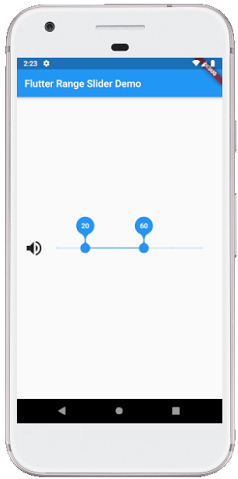
See the below code where range values are in the intervals of 10 because we have divided the slider into ten divisions from 0 to 100. It means our values are split between 0, 10, 20, 30, 40, and so on to 100. Here, we will initialize the range values with 20 and 50.
import 'package:flutter/material.dart';

void main() => runApp(MyApp());

// This Widget is the main application widget.
class MyApp extends StatelessWidget {
  @override
  Widget build(BuildContext context) {
    return MaterialApp(
      home: MySliderApp(),
    );
  }
}

class MySliderApp extends StatefulWidget {
  MySliderApp({Key key}) : super(key: key);

  @override
  _MySliderAppState createState() => _MySliderAppState();
}

class _MySliderAppState extends State< MySliderApp> {
  RangeValues _currentRangeValues = const RangeValues(20, 60);
  @override
  Widget build(BuildContext context) {
    return Scaffold(
        appBar: AppBar(
          title: Text('Flutter Range Slider Demo'),
        ),
        body: Padding(
          padding: EdgeInsets.all(15.0),
          child: Center(
              child: Row(
                  mainAxisAlignment: MainAxisAlignment.spaceEvenly,
                  mainAxisSize: MainAxisSize.max,
                  children: [
                    Icon(
                      Icons.volume_up,
                      size: 40,
                    ),
                    new Expanded(
                        child: RangeSlider(
                          values: _currentRangeValues,
                          min: 0,
                          max: 100,
                          divisions: 10,
                          labels: RangeLabels(
                            _currentRangeValues.start.round().toString(),
                            _currentRangeValues.end.round().toString(),
                          ),
                          onChanged: (RangeValues values) {
                            setState(() {
                              _currentRangeValues = values;
                            });
                          },
                        )
                    ),
                  ]
              )
          ),
        )
    );
  }
}
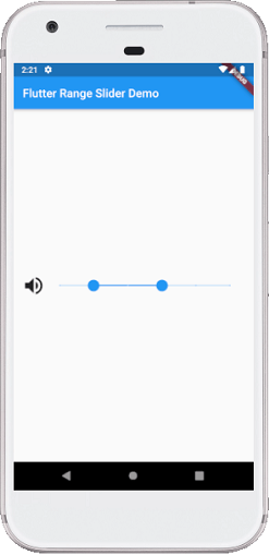
Output:
When we run this app in the IDE, we should get the UI similar to the below screenshot.
When we drag the slider, we can see the range of values to set the volume label.
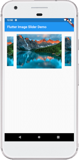
Flutter Image Slider
Image slider is a convenient way to display images, videos, or graphics in our app. Generally, it will show one big image at a time on our app screen. It helps to make our screen more attractive to the user.
Let us see how we can make an image slider in Flutter. There are many dependencies available in the Flutter library to create a sliding image in your app. Here, we are going to use flutter_swipper dependency. So first, we need to add the below dependency in the puspec.yaml file:
dependencies:
  flutter:
    sdk: flutter
  flutter_swiper: ^1.1.6
Next, add this dependency in your dart file as below:
import 'package:flutter_swiper/flutter_swiper.dart';
Example
The following code explains the use of the flutter_swipper library in a simple way. Here, we have taken an image from the network that displays on the screen.
import 'package:flutter/material.dart';
import 'package:flutter_swiper/flutter_swiper.dart';

void main(){ runApp(MyApp()); }

class MyApp extends StatelessWidget {
  @override
  Widget build(BuildContext context) {
    return MaterialApp(
        home: MyHomeScreen()
    );
  }
}

class MyHomeScreen extends StatelessWidget {
  @override
  Widget build(BuildContext context) {
    return Scaffold(
      appBar: AppBar(title: Text("Flutter Image Slider Demo"),),
      body: Container(
          padding: EdgeInsets.all(10),
          margin: EdgeInsets.all(5),
          alignment: Alignment.center,
          constraints: BoxConstraints.expand(
              height: 225
          ),
          child: imageSlider(context)),
    );
  }
}

Swiper imageSlider(context){
  return new Swiper(
    autoplay: true,
    itemBuilder: (BuildContext context, int index) {
      return new Image.network(
        "https://lh3.googleusercontent.com/wIcl3tehFmOUpq-Jl3hlVbZVFrLHePRtIDWV5lZwBVDr7kEAgLTChyvXUclMVQDRHDEcDhY=w640-h400-e365-rj-sc0x00ffffff",
        fit: BoxFit.fitHeight,
      );
    },
    itemCount: 10,
    viewportFraction: 0.7,
    scale: 0.8,
  );
}
Output:
When we run this app in the IDE, we should get the UI similar to the below screenshot. Here the image slides automatically.