Theoretical Paper
- Computer Organization
- Data Structure
- Digital Electronics
- Object Oriented Programming
- Discrete Mathematics
- Graph Theory
- Operating Systems
- Software Engineering
- Computer Graphics
- Database Management System
- Operation Research
- Computer Networking
- Image Processing
- Internet Technologies
- Micro Processor
- E-Commerce & ERP
- Dart Programming
- Flutter Tutorial
- Numerical Methods Tutorials
- Flutter Tutorials
Practical Paper
Industrial Training

Flutter Tooltip
A tooltip is a material design class in Flutter that provides text labels to explain the functionality of a button or user interface action. In other words, it is used to show additional information when the user moves or points over a particular widget. It increases the accessibility of our application. If we wrap the widget with it, then it is very useful when the user long presses the widget because, in that case, it appears as a floating label.
Properties:
The following are the properties used to customize the application.
message: It is a string message used to display in the tooltip.
height: It is used to specify the height of the tooltip's child.
textStyle: It is used to determine the style for the message of the tooltip.
margin: It is used to determine the empty space surrounds the tooltip.
showDuration: It is used to specify the length of time for showing the tooltip after a long press is released. By default, it is 1.5 seconds.
decoration: It is used to define the shape and background color of the tooltip. The default tooltip shape is a rounded rectangle that has a border-radius of 4.0 PX.
verticalOffset: It determines the vertical gap between the tooltip and the widget.
waitDuration: It is used to specify the time when a pointer hovers over a tooltip's widget before showing the tooltip. When the pointer leaves the widget, the tooltip message will be disappeared.
padding: It determines the space to inset the tooltip's child. By default, it is 16.0 PX in all directions.
preferBelow: It is used to specify whether the tooltip is being displayed below the widget or not. By default, it is true. The tooltip will be displayed in the opposite direction if we have not sufficient space to display the tooltip in the preferred direction.
How to use Tooltip Widget in Flutter?
We can use the tooltip in Flutter as the below code:
Tooltip(
        message: 'User Account',
        child: IconButton(
        icon: Icon(Icons.high_quality),
        onPressed: () {
        /* your code */
        },
    ),
),
Output:
Example
Let us understand it with the help of an example where we are trying to cover most of the above properties. In the following example, we are going to use a FlatButton with Icon as a child and surround this button with a tooltip. If we long press on this button, it will display a label with the message provided for the tooltip widget.
import 'package:flutter/material.dart';

void main() {runApp(MyApp());}

class MyApp extends StatelessWidget {
  @override
  Widget build(BuildContext context) {
    return MaterialApp(
        home: MyHomePage()
    );
  }
}

class MyHomePage extends StatefulWidget {
  @override
  _MyHomePageState createState() => _MyHomePageState();
}

class _MyHomePageState extends State< MyHomePage> {
  @override
  Widget build(BuildContext context) {
    return Scaffold(
      appBar: AppBar(
        title: Text("Flutter Tooltip Example"),
      ),
      body: Row(
          mainAxisAlignment: MainAxisAlignment.spaceEvenly,
          children:< Widget>[
            Container(
              margin: EdgeInsets.all(10),
              child: Tooltip(
                  waitDuration: Duration(seconds: 1),
                  showDuration: Duration(seconds: 2),
                  padding: EdgeInsets.all(5),
                  height: 35,
                  textStyle: TextStyle(
                      fontSize: 15, color: Colors.white, fontWeight: FontWeight.normal),
                  decoration: BoxDecoration(
                      borderRadius: BorderRadius.circular(10), color: Colors.green),
                  message: 'My Account',
                  child: FlatButton(
                    child: Icon(
                      Icons.account_box,
                      size: 100,
                    ),
                  )),
            ),
            Container(
              margin: EdgeInsets.all(10),
              child: Tooltip(
                  message: 'My Account',
                  child: FlatButton(
                    child: Icon(
                      Icons.account_box,
                      size: 100,
                    ),
                  )
              ),
            )
          ]
      ),
    );
  }
}
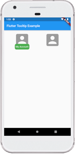
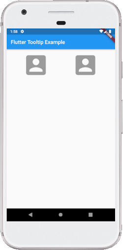
Output:
When we run the app in our IDE, we will see the UI as below screenshot:
If we long-press the icon, we will see the tooltip as below screenshot.