Theoretical Paper
- Computer Organization
- Data Structure
- Digital Electronics
- Object Oriented Programming
- Discrete Mathematics
- Graph Theory
- Operating Systems
- Software Engineering
- Computer Graphics
- Database Management System
- Operation Research
- Computer Networking
- Image Processing
- Internet Technologies
- Micro Processor
- E-Commerce & ERP
- Dart Programming
- Flutter Tutorial
- Numerical Methods Tutorials
- Flutter Tutorials
Practical Paper
Industrial Training

Flutter Checkbox
A checkbox is a type of input component which holds the Boolean value. It is a GUI element that allows the user to choose multiple options from several selections. Here, a user can answer only in yes or no value. A marked/checked checkbox means yes, and an unmarked/unchecked checkbox means no value. Typically, we can see the checkboxes on the screen as a square box with white space or a tick mark. A label or caption corresponding to each checkbox described the meaning of the checkboxes.
In this article, we are going to learn how to use checkboxes in Flutter. In Flutter, we can have two types of checkboxes: a compact version of the Checkbox named "checkbox" and the "CheckboxListTile" checkbox, which comes with header and subtitle. The detailed descriptions of these checkboxes are given below:
Checkbox:
| Attributes | Description |
| value | It is used whether the checkbox is checked or not. |
| onChanged | It will be called when the value is changed. |
| Tristate | It is false, by default. Its value can also be true, false, or null. |
| activeColor | It specified the color of the selected checkbox. |
| checkColor | It specified the color of the check icon when they are selected |
| materialTapTargetSize | It is used to configure the size of the tap target. |
Example:
Below is the demo example of checkbox:
Checkbox(
  value: this.showvalue,
  onChanged: (bool value) {
    setState(() {
      this.showvalue = value;
    });
  },
),
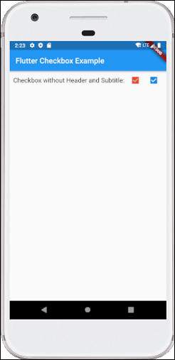
Let us write the complete code to see how checkbox is displayed in Flutter. First, create a project in android studio, open the main.dart file, and replace the code given below:
import 'package:flutter/material.dart';

void main() {
  runApp(MaterialApp( home: MyHomePage(),));
}

class MyHomePage extends StatefulWidget {
  @override
  _HomePageState createState() => _HomePageState();
}

class _HomePageState extends State< MyHomePage> {
  bool valuefirst = false;
  bool valuesecond = false;

  @override
  Widget build(BuildContext context) {
    return MaterialApp(
      home: Scaffold(
        appBar: AppBar(title: Text('Flutter Checkbox Example'),),
        body: Container(

            child: Column(
              children: < Widget>[
                Row(
                  children: < Widget>[
                    SizedBox(width: 10,),
                    Text('Checkbox without Header and Subtitle: ',style: TextStyle(fontSize: 17.0), ),
                    Checkbox(
                      checkColor: Colors.greenAccent,
                      activeColor: Colors.red,
                      value: this.valuefirst,
                      onChanged: (bool value) {
                        setState(() {
                          this.valuefirst = value;
                        });
                      },
                    ),
                    Checkbox(
                      value: this.valuesecond,
                      onChanged: (bool value) {
                        setState(() {
                          this.valuesecond = value;
                        });
                      },
                    ),
                  ],
                ),
              ],
            )
        ),
      ),
    );
  }
}
Output
Now execute the app in the emulator or device, we will see the below screen:
CheckboxListTitle:
| Attributes | Description |
| value | It is used whether the checkbox is checked or not. |
| onChanged | It will be called when the value is changed. |
| titile | It specified the main title of the list. |
| subtitle | It specified the subtitle of the list. Usually, it is used to add the description. |
| activeColor | It specified the color of the selected checkbox. |
| activeColor | It specified the color of the selected checkbox. |
| selected | By default, it is false. It highlights the text after selection. |
| secondary | It is the widget, which is displayed in front of the checkbox. |
Example:
Below is the demo example of CheckboxListTitle:
CheckboxListTile(
  secondary: const Icon(Icons.abc),
  title: const Text('demo mode'),
     subtitle: Text('sub demo mode'),
  value: this.subvalue,
  onChanged: (bool value) {
    setState(() {
      this.subvalue = value;
    });
  },
),
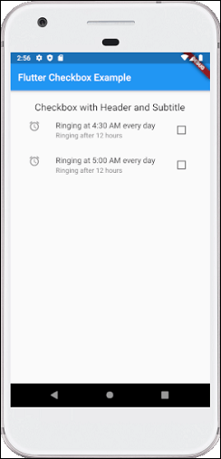
Let us write the complete code to see how CheckboxListTitle is displayed in Flutter. First, create a project in android studio, open the main.dart file, and replace the code given below:
import 'package:flutter/material.dart';

void main() {
  runApp(MaterialApp( home: MyHomePage(),));
}

class MyHomePage extends StatefulWidget {
  @override
  _HomePageState createState() => _HomePageState();
}

class _HomePageState extends State< MyHomePage> {
  bool valuefirst = false;
  bool valuesecond = false;

  @override
  Widget build(BuildContext context) {
    return MaterialApp(
      home: Scaffold(
        appBar: AppBar(title: Text('Flutter Checkbox Example'),),
        body: Container(
            padding: new EdgeInsets.all(22.0),
            child: Column(
              children: < Widget>[
                SizedBox(width: 10,),
                Text('Checkbox with Header and Subtitle',style: TextStyle(fontSize: 20.0), ),
                CheckboxListTile(
                  secondary: const Icon(Icons.alarm),
                  title: const Text('Ringing at 4:30 AM every day'),
                  subtitle: Text('Ringing after 12 hours'),
                  value: this.valuefirst,
                  onChanged: (bool value) {
                    setState(() {
                      this.valuefirst = value;
                    });
                  },
                ),
                CheckboxListTile(
                  controlAffinity: ListTileControlAffinity.trailing,
                  secondary: const Icon(Icons.alarm),
                  title: const Text('Ringing at 5:00 AM every day'),
                  subtitle: Text('Ringing after 12 hours'),
                  value: this.valuesecond,
                  onChanged: (bool value) {
                    setState(() {
                      this.valuesecond = value;
                    });
                  },
                ),
              ],
            )
        ),
      ),
    );
  }
}
Output
Now execute the app in the emulator or device, we will get the following screen: