Theoretical Paper
- Computer Organization
- Data Structure
- Digital Electronics
- Object Oriented Programming
- Discrete Mathematics
- Graph Theory
- Operating Systems
- Software Engineering
- Computer Graphics
- Database Management System
- Operation Research
- Computer Networking
- Image Processing
- Internet Technologies
- Micro Processor
- E-Commerce & ERP
- Dart Programming
- Flutter Tutorial
- Numerical Methods Tutorials
- Flutter Tutorials
Practical Paper
Industrial Training

Flutter Radio Button
A radio button is also known as the options button which holds the Boolean value. It allows the user to choose only one option from a predefined set of options. This feature makes it different from a checkbox where we can select more than one option and the unselected state to be restored. We can arrange the radio button in a group of two or more and displayed on the screen as circular holes with white space (for unselected) or a dot (for selected). We can also provide a label for each corresponding radio button describing the choice that the radio button represents. A radio button can be selected by clicking the mouse on the circular hole or using a keyboard shortcut.
In this section, we are going to explain how to use radio buttons in Flutter. Flutter allows us to use radio buttons with the help of 'Radio', 'RadioListTile', or 'ListTitle' Widgets.
The flutter radio button does not maintain any state itself. When we select any radio option, it invokes the onChanged callback and passing the value as a parameter. If the value and groupValue match, the radio option will be selected.
Let us see how we can create radio buttons in the Flutter app through the following steps:
Step 1: Create a Flutter project in the IDE. Here, I am going to use Android Studio.
Step 2: Open the project in Android Studio and navigate to the lib folder. In this folder, open the main.dart file and create a RadioButtonWidget class (Here: MyStatefulWidget). Next, we will create the Column widget and put three RadioListTile components. Also, we will create a Text widget for displaying the selected item. The ListTitle contains the following properties:
groupValue: It is used to specify the currently selected item for the radio button group.
title: It is used to specify the radio button label.
value: It specifies the backhand value, which is represented by a radio button.
onChanged: It will be called whenever the user selects the radio button.
ListTile(
  title: const Text('www.javatpoint.com'),
  leading: Radio(
    value: BestTutorSite.javatpoint,
    groupValue: _site,
    onChanged: (BestTutorSite value) {
      setState(() {
        _site = value;
      });
    },
  ),
),
Let us see the complete code of the above steps. Open the main.dart file and replace the following code.
Here, the Radio widgets wrapped in ListTiles and the currently selected text is passed into groupValue and maintained by the example's State. Here, the first Radio button will be selected off because _site is initialized to BestTutorSite.javatpoint. If the second radio button is pressed, the example's State is updated with setState, updating _site to BestTutorSite.w3schools. It rebuilds the button with the updated groupValue, and therefore it will select the second button.
import 'package:flutter/material.dart';

void main() => runApp(MyApp());

/// This Widget is the main application widget.
class MyApp extends StatelessWidget {
  static const String _title = 'Radio Button Example';

  @override
  Widget build(BuildContext context) {
    return MaterialApp(
      title: _title,
      home: Scaffold(
        appBar: AppBar(title: const Text(_title)),
        body: Center(
          child: MyStatefulWidget(),
        ),
      ),
    );
  }
}

enum BestTutorSite { javatpoint, w3schools, tutorialandexample }

class MyStatefulWidget extends StatefulWidget {
  MyStatefulWidget({Key key}) : super(key: key);

  @override
  _MyStatefulWidgetState createState() => _MyStatefulWidgetState();
}

class _MyStatefulWidgetState extends State< MyStatefulWidget> {
  BestTutorSite _site = BestTutorSite.javatpoint;

  Widget build(BuildContext context) {
    return Column(
      children: < Widget>[
        ListTile(
          title: const Text('www.javatpoint.com'),
          leading: Radio(
            value: BestTutorSite.javatpoint,
            groupValue: _site,
            onChanged: (BestTutorSite value) {
              setState(() {
                _site = value;
              });
            },
          ),
        ),
        ListTile(
          title: const Text('www.w3school.com'),
          leading: Radio(
            value: BestTutorSite.w3schools,
            groupValue: _site,
            onChanged: (BestTutorSite value) {
              setState(() {
                _site = value;
              });
            },
          ),
        ),
        ListTile(
          title: const Text('www.tutorialandexample.com'),
          leading: Radio(
            value: BestTutorSite.tutorialandexample,
            groupValue: _site,
            onChanged: (BestTutorSite value) {
              setState(() {
                _site = value;
              });
            },
          ),
        ),
      ],
    );
  }
}
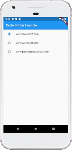
Output
When we run the app, the following output appears. Here, we have three radio buttons, and only one is selected by default. We can also select any other option.