Theoretical Paper
- Computer Organization
- Data Structure
- Digital Electronics
- Object Oriented Programming
- Discrete Mathematics
- Graph Theory
- Operating Systems
- Software Engineering
- Computer Graphics
- Database Management System
- Operation Research
- Computer Networking
- Image Processing
- Internet Technologies
- Micro Processor
- E-Commerce & ERP
- Dart Programming
- Flutter Tutorial
- Numerical Methods Tutorials
- Flutter Tutorials
Practical Paper
Industrial Training

Flutter Buttons
Buttons are the graphical control element that provides a user to trigger an event such as taking actions, making choices, searching things, and many more. They can be placed anywhere in our UI like dialogs, forms, cards, toolbars, etc.
Buttons are the Flutter widgets, which is a part of the material design library. Flutter provides several types of buttons that have different shapes, styles, and features.
Features of Buttons
The standard features of a button in Flutter are given below:
- We can easily apply themes on buttons, shapes, color, animation, and behavior.
- We can also theme icons and text inside the button.
- Buttons can be composed of different child widgets for different characteristics.
Types of Flutter Buttons
Following are the different types of button available in Flutter:
- Flat Button
- Raised Button
- Floating Button
- Drop Down Button
- Icon Button
- Inkwell Button
- PopupMenu Button
- Outline Button
Let us discuss each button in detail.
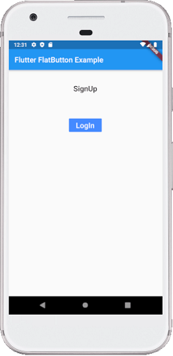
1. Flat Button
It is a text label button that does not have much decoration and displayed without any elevation. The flat button has two required properties that are: child and onPressed(). It is mostly used in toolbars, dialogs, or inline with other content. By default, the flat button has no color, and its text is black. But, we can use color to the button and text using color and textColor attributes, respectively.
Example:
Open the main.dart file and replace it with the below code.
import 'package:flutter/material.dart';

void main() {
  runApp(MyApp());
}

class MyApp extends StatefulWidget {
  @override
  _MyAppState createState() => _MyAppState();
}

class _MyAppState extends State< MyApp> {
  @override
  Widget build(BuildContext context) {
    return MaterialApp(
      home: Scaffold(
          appBar: AppBar(
            title: Text('Flutter FlatButton Example'),
          ),
          body: Center(child: Column(children: < Widget>[
            Container(
              margin: EdgeInsets.all(25),
              child: FlatButton(
                child: Text('SignUp', style: TextStyle(fontSize: 20.0),),
                onPressed: () {},
              ),
            ),
            Container(
              margin: EdgeInsets.all(25),
              child: FlatButton(
                child: Text('LogIn', style: TextStyle(fontSize: 20.0),),
                color: Colors.blueAccent,
                textColor: Colors.white,
                onPressed: () {},
              ),
            ),
          ]
         ))
      ),
    );
  }
}
Output:
If we run this app, we will see the following screen:
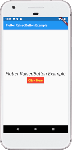
2. Raised Button
It is a button, which is based on the material widget and has a rectangular body. It is similar to a flat button, but it has an elevation that will increases when the button is pressed. It adds dimension to the UI along Z-axis. It has several properties like text color, shape, padding, button color, the color of a button when disabled, animation time, elevation, etc.
This button has two callback functions.
onPressed(): It is triggered when the button is pressed.
onLongPress(): It is triggered when the button is long pressed.
It is to note that this button is in a disabled state if onPressed() and onLongPressed() callbacks are not specified.
Example:
Open the main.dart file and replace it with the below code.
import 'package:flutter/material.dart';

void main() {
  runApp(MyApp());
}

class MyApp extends StatefulWidget {
  @override
  _MyAppState createState() => _MyAppState();
}

class _MyAppState extends State< MyApp> {
  String msg = 'Flutter RaisedButton Example';
  @override
  Widget build(BuildContext context) {
    return MaterialApp(
      home: Scaffold(
          appBar: AppBar(
            title: Text('Flutter RaisedButton Example'),
          ),
        body: Container(
          child: Center(
            child: Column(
              mainAxisAlignment: MainAxisAlignment.center,
              children: [
                Text(msg, style: TextStyle(fontSize: 30, fontStyle: FontStyle.italic),),
                RaisedButton(
                  child: Text("Click Here", style: TextStyle(fontSize: 20),),
                  onPressed: _changeText,
                  color: Colors.red,
                  textColor: Colors.yellow,
                  padding: EdgeInsets.all(8.0),
                  splashColor: Colors.grey,
                )
              ],
            ),
          ),
        ),
      ),
    );
  }
  _changeText() {
    setState(() {
      if (msg.startsWith('F')) {
        msg = 'We have learned FlutterRaised button example.';
      } else {
        msg = 'Flutter RaisedButton Example';
      }
    });
  }
}
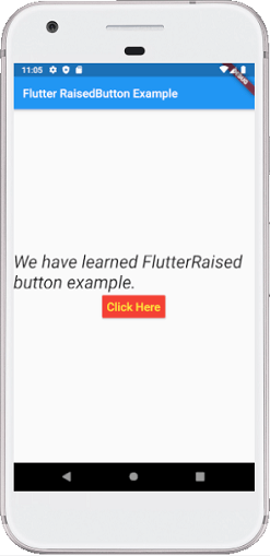
Output:
When we run this example, it will give the below screenshot. If we click on the "Click Here" button, it will change the text message. Show the second screenshot.
3. Floating Action Button
A FAB button is a circular icon button that triggers the primary action in our application. It is the most used button in today's applications. We can use this button for adding, refreshing, or sharing the content. Flutter suggests using at most one FAB button per screen. There are two types of Floating Action Button:
FloatingActionButton: It creates a simple circular floating button with a child widget inside it. It must have a child parameter to display a widget.
FloatingActionButton.extended: It creates a wide floating button along with an icon and a label inside it. Instead of a child, it uses labels and icon parameters.
Example:
Open the main.dart file and replace it with the below code.
import 'package:flutter/material.dart';

void main() {
  runApp(MyApp());
}

class MyApp extends StatefulWidget {
  @override
  _MyAppState createState() => _MyAppState();
}

class _MyAppState extends State< MyApp> {
  @override
  Widget build(BuildContext context) {
    return MaterialApp(home: Scaffold(
      appBar: AppBar(
        title: Text("FAB Button Example"),
        backgroundColor: Colors.blue,
        actions: < Widget>[
          IconButton(icon: Icon(Icons.camera_alt), onPressed: () => {}),
          IconButton(icon: Icon(Icons.account_circle), onPressed: () => {})
        ],
      ),
      floatingActionButton: FloatingActionButton(
        child: Icon(Icons.navigation),
        backgroundColor: Colors.green,
        foregroundColor: Colors.white,
        onPressed: () => {},
      ),
      /*floatingActionButton:FloatingActionButton.extended(
        onPressed: () {},
        icon: Icon(Icons.save),
        label: Text("Save"),
      ), */
    ),
    );
  }
}
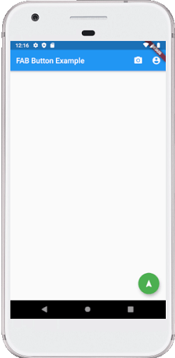
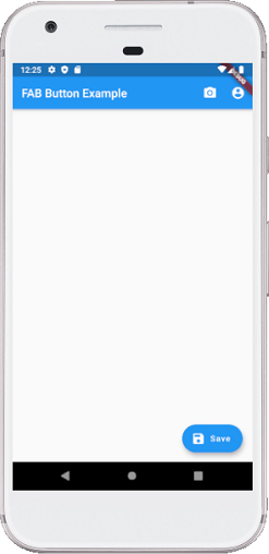
Output:
Run the application in android emulator, and it will give the UI similar to the following screenshot. The second image is an output of the FAB.extended button. Its coding can be seen in the above code's comment section.
4. DropDown Button
A drop-down button is used to create a nice overlay on the screen that allows the user to select any item from multiple options. Flutter allows a simple way to implement a drop-down box or drop-down button. This button shows the currently selected item and an arrow that opens a menu to select an item from multiple options.
Flutter provides a DropdownButton widget to implement a drop-down list. We can place it anywhere in our app.
Example
Open the main.dart file and replace it with the below code.
import 'package:flutter/material.dart';
void main() => runApp(MaterialApp(
home: MyApp(),
));
class MyApp extends StatefulWidget {
@override
_MyAppState createState() => _MyAppState();
}
class _MyAppState extends State< MyApp> {
List< ListItem> _dropdownItems = [
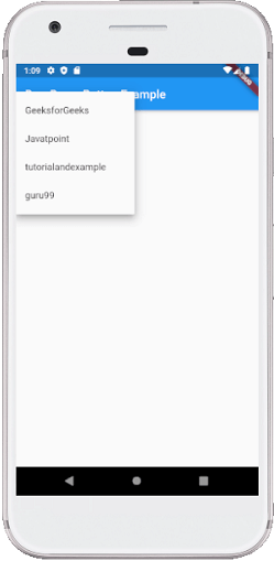
ListItem(1, "GeeksforGeeks"),
ListItem(2, "Javatpoint"),
ListItem(3, "tutorialandexample"),
ListItem(4, "guru99")
];
List< DropdownMenuItem< ListItem>> _dropdownMenuItems;
ListItem _itemSelected;
void initState() {
super.initState();
_dropdownMenuItems = buildDropDownMenuItems(_dropdownItems);
_itemSelected = _dropdownMenuItems[1].value;
}
List< DropdownMenuItem< ListItem>> buildDropDownMenuItems(List listItems) {
List< DropdownMenuItem< ListItem>> items = List();
for (ListItem listItem in listItems) {
items.add(
DropdownMenuItem(
child: Text(listItem.name),
value: listItem,
),
);
}
return items;
}
@override
Widget build(BuildContext context) {
return Scaffold(
appBar: AppBar(
title: Text("DropDown Button Example"),
),
body: Column(
children: < Widget>[
Padding(
padding: const EdgeInsets.all(10.0),
child: Container(
padding: const EdgeInsets.all(5.0),
decoration: BoxDecoration(
color: Colors.greenAccent,
border: Border.all()),
child: DropdownButtonHideUnderline(
child: DropdownButton(
value: _itemSelected,
items: _dropdownMenuItems,
onChanged: (value) {
setState(() {
_itemSelected = value;
});
}),
),
),
),
Text("We have selected ${_itemSelected.name}"),
],
),
);
}
}
class ListItem {
int value;
String name;
ListItem(this.value, this.name);
}
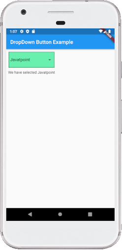
Output:
Run the application in android emulator, and it will give the UI similar to the following screenshot. The second image is an output of the list contains in the drop drown button.
5. Icon Button
An IconButton is a picture printed on the Material widget. It is a useful widget that gives the Flutter UI a material design feel. We can also customize the look and feel of this button. In simple terms, it is an icon that reacts when the user will touch it.
Example:
Open the main.dart file and replace it with the below code.
import 'package:flutter/material.dart';

void main() => runApp(MyApp());

class MyApp extends StatelessWidget {
  @override
  Widget build(BuildContext context) {
    return MaterialApp(
      home: Scaffold(
        appBar: AppBar(
          title: Text("Icon Button Example"),
        ),
        body: Center(
          child: MyStatefulWidget(),
        ),
      ),
    );
  }
}
double _speakervolume = 0.0;

class MyStatefulWidget extends StatefulWidget {
  MyStatefulWidget({Key key}) : super(key: key);

  @override
  _MyStatefulWidgetState createState() => _MyStatefulWidgetState();
}

class _MyStatefulWidgetState extends State< MyStatefulWidget> {
  Widget build(BuildContext context) {
    return Column(
      mainAxisSize: MainAxisSize.min,
      children: < Widget>[
        IconButton(
          icon: Icon(Icons.volume_up),
          iconSize: 50,
          color: Colors.brown,
          tooltip: 'Increase volume by 5',
          onPressed: () {
            setState(() {
              _speakervolume += 5;
            });
          },
        ),
        Text('Speaker Volume: $_speakervolume')
      ],
    );
  }
}
Output:
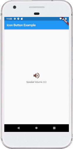
Run the application in android emulator, and it will give the UI similar to the following screenshot. When we press the volume button, it will always increase by 5.
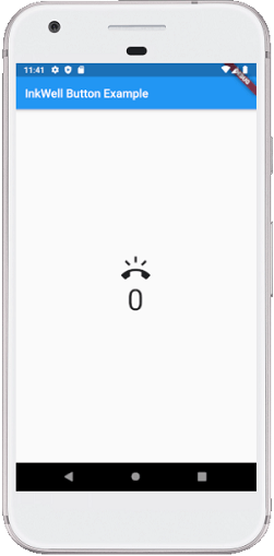
6. Inkwell Button
InkWell button is a material design concept, which is used for touch response. This widget comes under the Material widget where the ink reactions are actually painted. It creates the app UI interactive by adding gesture feedback. It is mainly used for adding splash ripple effect.
Example:
Open the main.dart file and replace it with the below code.
import 'package:flutter/material.dart';

void main() => runApp(MyApp());

class MyApp extends StatefulWidget {
  @override
  _MyAppState createState() => _MyAppState();
}

class _MyAppState extends State< MyApp> {
  int _volume = 0;

  @override
  Widget build(BuildContext context) {
    return MaterialApp(
      home: Scaffold(
        appBar: AppBar(
          title: Text('InkWell Button Example'),
        ),
        body: Center(
          child: new Column(
            mainAxisAlignment: MainAxisAlignment.center,
            children: < Widget>[
              InkWell(
                splashColor: Colors.green,
                highlightColor: Colors.blue,
                child: Icon(Icons.ring_volume, size: 50),
                onTap: () {
                  setState(() {
                    _volume += 2;
                  });
                },
              ),
              Text (
                  _volume.toString(),
                  style: TextStyle(fontSize: 50)
              ),
            ],
          ),
        ),
      ),
    );
  }
}
Output:
Run the application in android emulator, and it will give the UI similar to the following screenshot. Every time we press the ring volume button, it will increase the volume by 2.
7. PopupMenu Button
It is a button that displays the menu when it is pressed and then calls the onSelected method the menu is dismissed. It is because the item from the multiple options is selected. This button contains a text and an image. It will mainly use with Settings menu to list all options. It helps in making a great user experience.
Example:
Open the main.dart file and replace it with the below code.
import 'package:flutter/material.dart';

void main() { runApp(MyApp());}

class MyApp extends StatefulWidget {
  @override
  _MyAppState createState() => _MyAppState();
}

class _MyAppState extends State< MyApp> {
  Choice _selectedOption = choices[0];

  void _select(Choice choice) {
    setState(() {
      _selectedOption = choice;
    });
  }
  @override
  Widget build(BuildContext context) {
    return MaterialApp(
      home: Scaffold(
        appBar: AppBar(
          title: const Text('PopupMenu Button Example'),
          actions: < Widget>[
            PopupMenuButton< Choice>(
              onSelected: _select,
              itemBuilder: (BuildContext context) {
                return choices.skip(0).map((Choice choice) {
                  return PopupMenuItem< Choice>(
                    value: choice,
                    child: Text(choice.name),
                  );
                }).toList();
              },
            ),
          ],
        ),
        body: Padding(
          padding: const EdgeInsets.all(10.0),
          child: ChoiceCard(choice: _selectedOption),
        ),
      ),
    );
  }
}

class Choice {
  const Choice({this.name, this.icon});
  final String name;
  final IconData icon;
}

const List< Choice> choices = const < Choice>[
  const Choice(name: 'Wi-Fi', icon: Icons.wifi),
  const Choice(name: 'Bluetooth', icon: Icons.bluetooth),
  const Choice(name: 'Battery', icon: Icons.battery_alert),
  const Choice(name: 'Storage', icon: Icons.storage),
];

class ChoiceCard extends StatelessWidget {
  const ChoiceCard({Key key, this.choice}) : super(key: key);

  final Choice choice;

  @override
  Widget build(BuildContext context) {
    final TextStyle textStyle = Theme.of(context).textTheme.headline;
    return Card(
      color: Colors.greenAccent,
      child: Center(
        child: Column(
          mainAxisSize: MainAxisSize.min,
          crossAxisAlignment: CrossAxisAlignment.center,
          children: < Widget>[
            Icon(choice.icon, size: 115.0, color: textStyle.color),
            Text(choice.name, style: textStyle),
          ],
        ),
      ),
    );
  }
}
Output:
Run the application in android emulator, and it will give the UI similar to the following screenshot. When we click the three dots shown at the top left corner of the screen, it will pop up the multiple options. Here, we can select any option, and it will keep it in the card, as shown in the second image.
8. Outline Button
It is similar to the flat button, but it contains a thin grey rounded rectangle border. Its outline border is defined by the shape attribute.
Example:
Open the main.dart file and replace it with the below code.
import 'package:flutter/material.dart';

void main() {
  runApp(MyApp());
}

class MyApp extends StatefulWidget {
  @override
  _MyAppState createState() => _MyAppState();
}

class _MyAppState extends State< MyApp> {
  @override
  Widget build(BuildContext context) {
    return MaterialApp(
      home: Scaffold(
          appBar: AppBar(
            title: Text('Outline Button Example'),
          ),
          body: Center(child: Column(children: < Widget>[
            Container(
              margin: EdgeInsets.all(25),
              child: OutlineButton(
                child: Text("Outline Button", style: TextStyle(fontSize: 20.0),),
                highlightedBorderColor: Colors.red,
                shape: RoundedRectangleBorder(
                    borderRadius: BorderRadius.circular(15)),
                onPressed: () {},
              ),
            ),
            Container(
              margin: EdgeInsets.all(25),
              child: FlatButton(
                child: Text('Flat Button', style: TextStyle(fontSize: 20.0),),
                color: Colors.blueAccent,
                textColor: Colors.white,
                onPressed: () {},
              ),
            ),
          ]
          ))
      ),
    );
  }
}
Output:
Run the application in android emulator, and it will give the UI similar to the following screenshot.
Button Bar
Flutter provides the flexibility to arrange the buttons in a bar or a row. ButtonBar widget contains three properties: alignment, children, and mainAxisSize.
- Alignment is used to present the aligning option to the entire button bar widget.
- Children attribute is used to take the number of buttons in a bar.
- mainAxisSize attribute is used to provide the horizontal space for the button bar.
Example:
Open the main.dart file and replace it with the below code.
import 'package:flutter/material.dart';

void main() {
  runApp(MaterialApp( home: MyApp(),));
}

class MyApp extends StatefulWidget {
  @override
  _State createState() => _State();
}

class _State extends State< MyApp> {
  @override
  Widget build(BuildContext context) {
    return Scaffold(
        appBar: AppBar(
          title: Text('Flutter ButtonBar Example'),
        ),
        body: Padding(
            padding: EdgeInsets.all(10),
            child: Column(
              children: < Widget>[
                Padding(
                  padding: EdgeInsets.all(15),
                  child: new ButtonBar(
                    mainAxisSize: MainAxisSize.min,
                    children: < Widget>[
                      RaisedButton(
                        child: new Text('Javatpoint'),
                        color: Colors.lightGreen,
                          onPressed: () {/** */},
                      ),
                      FlatButton(
                        child: Text('Flutter'),
                        color: Colors.lightGreen,
                        onPressed: () {/** */},
                      ),
                      FlatButton(
                        child: Text('MySQL'),
                        color: Colors.lightGreen,
                        onPressed: () {/** */},
                      ),
                    ],
                  ),
                ),
              ],
            )
        )
    );
  }
}
Output:
Run the application in android emulator, and it will give the UI similar to the following screenshot. Here, we can see that the three buttons are placed in a horizontal bar or row.