Theoretical Paper
- Computer Organization
- Data Structure
- Digital Electronics
- Object Oriented Programming
- Discrete Mathematics
- Graph Theory
- Operating Systems
- Software Engineering
- Computer Graphics
- Database Management System
- Operation Research
- Computer Networking
- Image Processing
- Internet Technologies
- Micro Processor
- E-Commerce & ERP
- Dart Programming
- Flutter Tutorial
- Numerical Methods Tutorials
- Flutter Tutorials
Practical Paper
Industrial Training

Flutter Stack
The stack is a widget in Flutter that contains a list of widgets and positions them on top of the other. In other words, the stack allows developers to overlap multiple widgets into a single screen and renders them from bottom to top. Hence, the first widget is the bottommost item, and the last widget is the topmost item
Key Points Related to Stack Widget
The following are the key points of the Flutter stack widget:
- The child widget in a stack can be either positioned or non-positioned.
- Positioned items are wrapped in Positioned widget and must have a one non-null property
- The non-positioned child widgets are aligned itself. It displays on the screen based on the stack's alignment. The default position of the children is in the top left corner.
- We can use the alignment attribute to change the alignment of the widgets.
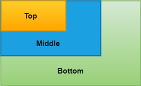
- Stack places the children widgets in order with the first child being at the bottom and the last child being at the top. If we want to reorder the children's widget, it is required to rebuild the stack in the new order. By default, the first widget of each stack has the maximum size compared to other widgets.
How to use a stack widget in Flutter?
The below example helps to understand the use of stack widget quickly that contains three containers of shrinking size:
Stack(
  children: < Widget>[
    // Max Size
    Container(
      color: Colors.green,
    ),
    Container(
      color: Colors.blue,
    ),
    Container(
      color: Colors.yellow,
    )
  ],
),
It will give the following output:
Properties of the Stack Widget
The following are the properties used with the stack widget:
alignment: It determines how the children widgets are positioned in the stack. It can be top, bottom, center, center-right, etc.
Stack(
  alignment: Alignment.topCenter, // Center of Top
  children: < Widget>[ ]
)
textDirection: It determines the text direction. It can draw the text either ltr (left to right) or rtl (right to the left).
Stack(
  textDirection: TextDirection.rtl, // Right to Left
  children: < Widget>[ ]
)
fit: It will control the size of non-positioned children widgets in the stack. It has three types: loose, expand and passthrough. The loose used to set the child widget small, the expand attribute makes the child widget as large as possible, and the passthrough set the child widget depending on its parent widget.
Stack(
  fit: StackFit.passthrough,
  children: < Widget>[ ]
)
overflow: It controls the children widgets, whether visible or clipped, when it's content overflowing outside the stack.
Stack(
  overflow: Overflow.clip, // Clip the Content
  children: < Widget>[ ]
)
clipBehavior: It determines whether the content will be clipped or not.
Positioned
It is not the stack parameter but can be used in the stack to locate the children widgets. The following are the constructor of the positioned stack:
const Positioned({
Key key,
this.left,
this.top,
this.right,
this.bottom,
this.width,
this.height,
@required Widget child,
})
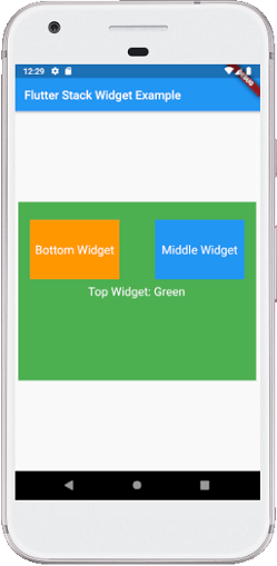
Stack Widget Example
The below code explains how to use the stack widget in Flutter. In this code, we are going to try most of the essential attributes of the stack widget.
import 'package:flutter/material.dart';

void main() => runApp(MyApp());

/// This Widget is the main application widget.
class MyApp extends StatelessWidget {
  @override
  Widget build(BuildContext context) {
    return MaterialApp(
      home: MyStackWidget(),
    );
  }
}

class MyStackWidget extends StatelessWidget {
  @override
  Widget build(BuildContext context) {
    return MaterialApp(
      home: Scaffold(
        appBar: AppBar(
          title: Text("Flutter Stack Widget Example"),
        ),
        body: Center(
          child: Stack(
            fit: StackFit.passthrough,
            overflow: Overflow.visible,
            children: < Widget>[
              // Max Size Widget
              Container(
                height: 300,
                width: 400,
                color: Colors.green,
                child: Center(
                  child: Text(
                    'Top Widget: Green',
                    style: TextStyle(color: Colors.white, fontSize: 20),
                  ),
                ),
              ),
              Positioned(
                top: 30,
                right: 20,
                child: Container(
                  height: 100,
                  width: 150,
                  color: Colors.blue,
                  child: Center(
                    child: Text(
                      'Middle Widget',
                      style: TextStyle(color: Colors.white, fontSize: 20),
                    ),
                  ),
                ),
              ),
              Positioned(
                top: 30,
                left: 20,
                child: Container(
                  height: 100,
                  width: 150,
                  color: Colors.orange,
                  child: Center(
                    child: Text(
                      'Bottom Widget',
                      style: TextStyle(color: Colors.white, fontSize: 20),
                    ),
                  ),
                )
              ),
            ],
          ),
        )
      ),
    );
  }
}
Output:
When we run the app, we should get the UI of the screen similar to the below screenshot:
Flutter IndexedStack
It is another stack widget in Flutter that displayed only one element at one time by specifying its index. See the below code snippet:
IndexedStack(
  index: 1,
  children: < Widget>[
    Container(
      color: Colors.green,
    ),
    Container(
      color: Colors.blue,
    ),
    Container(
      color: Colors.yellow,
    )
  ],
)
IndexedStack takes children like a usual stack, but it will display only one child at a time. Therefore, it is not a stack. We use it for easily switching between one child to another child according to our needs.
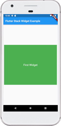
IndexedStack Widget Example
The below code explains how to use indexed stack widget in Flutter:
import 'package:flutter/material.dart';

void main() => runApp(MyApp());

/// This Widget is the main application widget.
class MyApp extends StatelessWidget {
  @override
  Widget build(BuildContext context) {
    return MaterialApp(
      home: MyStackWidget(),
    );
  }
}

class MyStackWidget extends StatelessWidget {
  @override
  Widget build(BuildContext context) {
    return MaterialApp(
      home: Scaffold(
        appBar: AppBar(
          title: Text("Flutter Stack Widget Example"),
        ),
        body: Center(
          child: IndexedStack(
            index: 0,
            children: < Widget>[
              Container(
                height: 300,
                width: 400,
                color: Colors.green,
                child: Center(
                  child: Text(
                    'First Widget',
                    style: TextStyle(color: Colors.white, fontSize: 20),
                  ),
                ),
              ),
              Container(
                height: 250,
                width: 250,
                color: Colors.blue,
                child: Center(
                  child: Text(
                    'Second Widget',
                    style: TextStyle(color: Colors.white, fontSize: 20),
                  ),
                ),
              ),
            ],
          ),
        )
      ),
    );
  }
}
Output:
When we run the app, we should get the UI of the screen similar to the below screenshot:
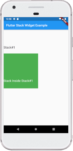
Is it possible to wrap stack inside stack in Flutter?
Yes, it is possible to wrap stack inside stack in Flutter. We can do this by wrapping the second stack inside the container with height and width property.
See the below code to understand it more clearly:
import 'package:flutter/material.dart';

void main() => runApp(MyApp());

class MyApp extends StatelessWidget {
  @override
  Widget build(BuildContext context) {
    return MaterialApp(
      home: MyStackWidget(),
    );
  }
}

class MyStackWidget extends StatelessWidget {
  @override
  Widget build(BuildContext context) {
    return MaterialApp(
      home: Scaffold(
        appBar: AppBar(
          title: Text("Flutter Stack Widget Example"),
        ),
        body: Center(
          child: Stack(
            children: [
              Positioned(
                top: 100,
                child: Text(
                    "Stack#1",
                    style: TextStyle(color: Colors.black, fontSize: 20)
                ),
              ),
              Positioned(
                top: 150.0,
                child: Container(
                  height: 220,
                  width: 220,
                  color: Colors.green,
                  child: Stack(
                    children: [
                      Positioned(
                        top:160,
                        child: Text(
                          "Stack Inside Stack#1",
                          style: TextStyle(color: Colors.white, fontSize: 20)
                        ),
                      )
                    ],
                  ),
                ),
              )
            ],
          ),
        )
      ),
    );
  }
}
When we run the app, we should get the UI of the screen similar to the below screenshot: