Theoretical Paper
- Computer Organization
- Data Structure
- Digital Electronics
- Object Oriented Programming
- Discrete Mathematics
- Graph Theory
- Operating Systems
- Software Engineering
- Computer Graphics
- Database Management System
- Operation Research
- Computer Networking
- Image Processing
- Internet Technologies
- Micro Processor
- E-Commerce & ERP
- Dart Programming
- Flutter Tutorial
- Numerical Methods Tutorials
- Flutter Tutorials
Practical Paper
Industrial Training

Flutter Themes
Themes are the preset packages that contain the graphical appearances to our website or mobile app screen. It makes the user interface more attractive. We mainly use themes for sharing the colors and fonts styles throughout the app.
In mobile development, it becomes mandatory to add the Light and Dark theme for our app. Today's most people prefer the dark version of the theme over the light version theme because it makes them more comfortable to their eyes and increases battery life.
In Flutter, we can either use Theme widgets that contain the colors and font styles for a specific area of the application or define app-wide themes. The app-wide themes are also Theme widgets, which are created in the root of our app under the MaterialApp widget.
After defining a theme, we can use it in any widget wherever we need it in the app. Material widgets in Flutter can also use our Theme to set the font styles and background colors for AppBars, Buttons, Buttons, Checkboxes, and many more.
Flutter uses the default theme while creating an application. If we want to share a custom theme to the entire application, we need to use a ThemeData under the MateialApp() widget.
Sometimes we want to override the app-wide theme in the part of an application. In that case, we need to wrap the section of the app in the theme widget. Flutter allows us two approaches to do this:
- By creating a unique ThemeData
- By extending the parent theme
By creating a unique ThemeData
The first approach is used when we do not want to inherit any application colors or font styles. In that case, we will create an instance of ThemeData() and pass it to the Theme widget, as shown in the below code snippet:
Theme(
  data: ThemeData(
    accentColor: Colors.blue,
  ),
  child: FloatingActionButton(
    onPressed: () {},
    child: Icon(Icons.person),
  ),
);
By extending the parent theme
If you do not want to override anything, use the second approach that extends the parent theme. It can be handle with the use of copyWith() method. See the below code snippet:
Theme(
  data: Theme.of(context).copyWith(accentColor: Colors.blue),
  child: FloatingActionButton(
    onPressed: null,
    child: Icon(Icons.person),
  ),
);
How to use a Theme
After defining a theme, we can use it into the widget build() methods with the Theme.of(context) method. This method looks into the widget tree and returns the very first theme in the tree. If you have a not defined above your widget, the app's theme will be returned.
In the below code snippet, the FloatingActionButton uses this technique for returning the accentColor.
Container(
  color: Theme.of(context).accentColor,
  child: Text(
    'Text with a background color',
    style: Theme.of(context).textTheme.headline,
  ),
);
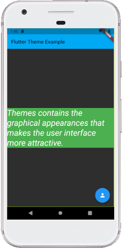
Let us understand how to use ThemeData in Flutter application through the below example.
import 'package:flutter/material.dart';

void main() {runApp(MyApp());}

class MyApp extends StatelessWidget {
  @override
  Widget build(BuildContext context) {
    return MaterialApp(
      theme: ThemeData(
        // Define the default brightness and colors.
        brightness: Brightness.dark,
        primaryColor: Colors.lightBlue,
        accentColor: Colors.green,

        // Define the default font family.
        fontFamily: 'Monotype Coursiva',

        // Define the TextTheme that specifies the default
        // text styling for headlines, titles, bodies of text, and more.
        textTheme: TextTheme(
          headline: TextStyle(fontSize: 32.0, fontStyle: FontStyle.italic, fontFamily: 'Hind')
        ),
      ),
      home: MyThemePage(),
    );
  }
}

class MyThemePage extends StatelessWidget {
  @override
  Widget build(BuildContext context) {
    return Scaffold(
      appBar: AppBar(
        title: Text('Flutter Theme Example'),
      ),
      body: Center(
        child: Container(
          color: Theme.of(context).accentColor,
          child: Text(
            'Themes contains the graphical appearances that makes the user interface more attractive.',
            style: Theme.of(context).textTheme.headline,
          ),
        ),
      ),
      floatingActionButton: Theme(
        data: Theme.of(context).copyWith(
          colorScheme:
          Theme.of(context).colorScheme.copyWith(secondary: Colors.blue),
        ),
        child: FloatingActionButton(
          onPressed: null,
          child: Icon(Icons.person),
        ),
      ),
    );
  }
}
Output:
When we run the app in the device or emulator, we will see the UI similar to the below screenshot.