Theoretical Paper
- Computer Organization
- Data Structure
- Digital Electronics
- Object Oriented Programming
- Discrete Mathematics
- Graph Theory
- Operating Systems
- Software Engineering
- Computer Graphics
- Database Management System
- Operation Research
- Computer Networking
- Image Processing
- Internet Technologies
- Micro Processor
- E-Commerce & ERP
- Dart Programming
- Flutter Tutorial
- Numerical Methods Tutorials
- Flutter Tutorials
Practical Paper
Industrial Training

Flutter Scaffold
The Scaffold is a widget in Flutter used to implements the basic material design visual layout structure. It is quick enough to create a general-purpose mobile application and contains almost everything we need to create a functional and responsive Flutter apps. This widget is able to occupy the whole device screen. In other words, we can say that it is mainly responsible for creating a base to the app screen on which the child widgets hold on and render on the screen. It provides many widgets or APIs for showing Drawer, SnackBar, BottomNavigationBar, AppBar, FloatingActionButton, and many more.
The Scaffold class is a shortcut to set up the look and design of our app that allows us not to build the individual visual elements manually. It saves our time to write more code for the look and feel of the app. The following are the constructor and properties of the Scaffold widget class.
const Scaffold({
  Key key,
  this.appBar,
  this.body,
  this.floatingActionButton,
  this.floatingActionButtonLocation,
  this.persistentFooterButtons,
  this.drawer,
  this.endDrawer,
  this.bottomNavigationBar,
  this.bottomSheet,
  this.floatingActionButtonAnimator,
  this.backgroundColor,
  this.resizeToAvoidBottomPadding = true,
  this.primary = true,
})
Let us understand all of the above properties in detail.
1. appBar: It is a horizontal bar that is mainly displayed at the top of the Scaffold widget. It is the main part of the Scaffold widget and displays at the top of the screen. Without this property, the Scaffold widget is incomplete. It uses the appBar widget that itself contains various properties like elevation, title, brightness, etc. See the below example:
Widget build(BuildContext context)
{
  return Scaffold(
    appBar: AppBar(
      title: Text('First Flutter Application'),
    ), )
}
In the above code, the title property uses a Text widget for displaying the text on the screen.
2. body: It is the other primary and required property of this widget, which will display the main content in the Scaffold. It signifies the place below the appBar and behind the floatingActionButton & drawer. The widgets inside the body are positioned at the top-left of the available space by default. See the below code:
Widget build(BuildContext context) {
return Scaffold(
    appBar: AppBar(
    title: Text('First Flutter Application'),
    ),
    body: Center(
    child: Text("Welcome to Javatpoint",
        style: TextStyle( color: Colors.black, fontSize: 30.0,
        ),
         ),
    ),
}
In the above code, we have displayed a text "Welcome to Javatpoint!!" in the body attribute. This text is aligned in the center of the page by using the Center widget. Here, we have also styled the text by using the TextStyle widget, such as color, font size, etc.
3. drawer: It is a slider panel that is displayed at the side of the body. Usually, it is hidden on the mobile devices, but the user can swipe it left to right or right to left to access the drawer menu. It uses the Drawer widget properties slides in a horizontal direction from the Scaffold edge to show navigation links in the application. An appropriate icon for the drawer is set automatically in an appBar property. The gesture is also set automatically to open the drawer. See the following code.
drawer: Drawer(
        child: ListView(
        children: const < Widget>[
        DrawerHeader(
            decoration: BoxDecoration(
            color: Colors.red,
            ),
            child: Text(
            'Welcome to Javatpoint',
            style: TextStyle(
                color: Colors.green,
                fontSize: 30,
            ),
              ),
        ),
        ListTile(
            title: Text('1'),
        ),
        ListTile(
            title: new Text("All Mail Inboxes"),
            leading: new Icon(Icons.mail),
        ),
        Divider(
            height: 0.2,
        ),
        ListTile(
            title: new Text("Primary"),
        ),
        ListTile(
            title: new Text("Social"),
        ),
        ListTile(
            title: new Text("Promotions"),
        ),
        ],
         ),
  ),
In the above code, we use the drawer property of Scaffold for creating a drawer. We have also used some other widgets to make it attractive. In the ListView widget, we have divided the panel into two parts, Header and Menu. The DrawerHeader property modifies the panel header that also contains an icon or details according to the application. Again, we have used ListTile to add the list items in the menu.
4. floatingActionButton: It is a button displayed at the bottom right corner and floating above the body. It is a circular icon button that floats over the content of a screen at a fixed place to promote a primary action in the application. While scrolling the page, its position cannot be changed. It uses the FloatingActionButton widget properties using Scaffold.floatingActionButton. See the below code:
Widget build(BuildContext context) {
         return Scaffold(
    appBar: AppBar(title: Text('First Flutter Application')),
    body: Center(
        child: Text("Welcome to Javatpoint!!"),
    ),
    floatingActionButton: FloatingActionButton(
        elevation: 8.0,
        child: Icon(Icons.add),
        onPressed: (){
           print('I am Floating Action Button');
        }
    );
}
In the above code, we have used the elevation property that gives a shadow effect to the button. We have also used the Icon widget to give an icon to the button using preloaded Flutter SDK icons. The onPressed() property will be called when the user taps the button, and the statements "I am Floating Action Button" will be printed on the console.
5. backgroundColor: This property is used to set the background color of the whole Scaffold widget.
backgroundColor: Colors.yellow,
6. primary: It is used to tell whether the Scaffold will be displayed at the top of the screen or not. Its default value is true that means the height of the appBar extended by the height of the screen's status bar.
primary: true/false,
7. persistentFooterButton: It is a list of buttons that are displayed at the bottom of the Scaffold widget. These property items are always visible; even we have scroll the body of the Scaffold. It is always wrapped in a ButtonBar widget. They are rendered below the body but above the bottomNavigationBar.
persistentFooterButtons: < Widget>[
  RaisedButton(
    onPressed: () {},
    color: Colors.blue,
    child: Icon(
      Icons.add,
      color: Colors.white,
    ),
  ),
  RaisedButton(
    onPressed: () {},
    color: Colors.green,
    child: Icon(
      Icons.clear,
      color: Colors.white,
    ),
  ),
],
In the above code, we have used the RaisedButton that displays at the bottom of the Scaffold. We can also use the FlatButton instead of the RaisedButton.
8. bottomNavigationBar: This property is like a menu that displays a navigation bar at the bottom of the Scaffold. It can be seen in most of the mobile applications. This property allows the developer to add multiple icons or texts in the bar as items. It should be rendered below the body and persistentFooterButtons. See the below code:
bottomNavigationBar: BottomNavigationBar(
  currentIndex: 0,
  fixedColor: Colors.grey,
  items: [
    BottomNavigationBarItem(
      title: Text("Home"),
      icon: Icon(Icons.home),
    ),
    BottomNavigationBarItem(
      title: Text("Search"),
      icon: Icon(Icons.search),
    ),
    BottomNavigationBarItem(
      title: Text("User Profile"),
      icon: Icon(Icons.account_circle),
    ),
  ],
  onTap: (int itemIndex){
    setState(() {
      _currentIndex = itemIndex;
    });
  },
),
In the above code, we have used the BottomNavigationBar widget to display the menu bar. The fixedColor property is used for the color of the active icon. The BottomNavigationBarItems widget is used to add items in the bar containing text and icon as its child property. We had also used onTap(int itemIndex) function to perform an action when we tapped on the items, which works according to their index position.
9. endDrawer: It is similar to a drawer property, but they are displayed at the right side of the screen by default. It can be swiped right to left or left to right.
10. resizeToAvoidBottomInset: If it is true, the body and the Scaffold's floating widgets should adjust their size themselves to avoid the onscreen keyboard. The bottom property defines the onscreen keyboard height.
11. floatingActionButtonLocation: By default, it is positioned at the bottom right corner of the screen. It is used to determine the position of the floatingActionButton. It contains many predefined constants, such as centerDocked, centerFloat, endDocked, endFloat, etc.
That's all about the Scaffold's various properties that give us an overview of the Scaffold widget. Its main purpose is to get familiar with different properties and their usage in Flutter application. If we want to learn it in more detail, refer to the flutter documentation here.
Let us see the example where we have tried to use most of the Scaffold properties to understand this widget quickly and easily.
In this example, we are going to see a Scaffold widget with an AppBar, BottomAppBar, FloatingActionButton, floatingActionButtonLocation, and drawer properties.
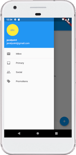
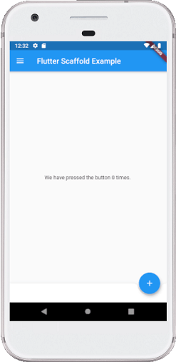
import 'package:flutter/material.dart';

void main() => runApp(MyApp());

/// This Widget is the main application widget.
class MyApp extends StatelessWidget {
  @override
  Widget build(BuildContext context) {
    return MaterialApp(
      home: MyStatefulWidget(),
    );
  }
}

class MyStatefulWidget extends StatefulWidget {
  MyStatefulWidget({Key key}) : super(key: key);

  @override
  _MyStatefulWidgetState createState() => _MyStatefulWidgetState();
}

class _MyStatefulWidgetState extends State< MyStatefulWidget> {
  int _count = 0;

  Widget build(BuildContext context) {
    return Scaffold(
      appBar: AppBar(
        title: Text('Flutter Scaffold Example'),
      ),
      body: Center(
        child: Text('We have pressed the button $_count times.'),
      ),
      bottomNavigationBar: BottomAppBar(
        shape: const CircularNotchedRectangle(),
        child: Container(
          height: 50.0,
        ),
      ),
      floatingActionButton: FloatingActionButton(
        onPressed: () => setState(() {
          _count++;
        }),
        tooltip: 'Increment Counter',
        child: Icon(Icons.add),
      ),
      floatingActionButtonLocation: FloatingActionButtonLocation.endDocked,
      drawer: Drawer(
        elevation: 20.0,
        child: Column(
          children: < Widget>[
            UserAccountsDrawerHeader(
              accountName: Text("javatpoint"),
              accountEmail: Text("javatpoint@gmail.com"),
              currentAccountPicture: CircleAvatar(
                backgroundColor: Colors.yellow,
                child: Text("abc"),
              ),
            ),
            ListTile(
              title: new Text("Inbox"),
              leading: new Icon(Icons.mail),
            ),
            Divider( height: 0.1,),
            ListTile(
              title: new Text("Primary"),
              leading: new Icon(Icons.inbox),
            ),
            ListTile(
              title: new Text("Social"),
              leading: new Icon(Icons.people),
            ),
            ListTile(
              title: new Text("Promotions"),
              leading: new Icon(Icons.local_offer),
            )
          ],
        ),
      ),
    );
  }
}
Output:
When we run this project in the IDE, we will see the UI as the following screenshot.
If we click on the three lines that can be seen in the top left corner of the screen, we will see the drawer. The drawer can be swiped right to left or left to right. See the below image.