Theoretical Paper
- Computer Organization
- Data Structure
- Digital Electronics
- Object Oriented Programming
- Discrete Mathematics
- Graph Theory
- Operating Systems
- Software Engineering
- Computer Graphics
- Database Management System
- Operation Research
- Computer Networking
- Image Processing
- Internet Technologies
- Micro Processor
- E-Commerce & ERP
- Dart Programming
- Flutter Tutorial
- Numerical Methods Tutorials
- Flutter Tutorials
Practical Paper
Industrial Training

Flutter Card
A card is a sheet used to represent the information related to each other, such as an album, a geographical location, contact details, etc. A card in Flutter is in rounded corner shape and has a shadow. We mainly used it to store the content and action of a single object. In this article, we are going to learn how to create a card widget in Flutter. We will also learn how to customize the card widget.
Card creation in Flutter is very simple. We just need to call the card constructor and then pass a widget as child property for displaying the content and action inside the card. See the below code of simple card creation:
return Card(
    child: Column(
      mainAxisSize: MainAxisSize.min,
      children: < Widget>[
        const ListTile(
          leading: Icon(Icons.album, size: 45),
          title: Text('Sonu Nigam'),
          subtitle: Text('Best of Sonu Nigam Song'),
        ),
      ],
    ),
  );
Flutter Card Properties
We can customize the card using the properties. Some of the essential properties are given below:
| Attribute Name | Descriptions |
| borderOnForeground | It is used to paint the border in front of a child. By default, it is true. If it is false, it painted the border behind the child. |
| color | It is used to color the card's background. |
| elevation | It controls the shadow size below the card. The bigger elevation value makes the bigger shadow distance. |
| margin | It is used to customize the card's outer space. |
| shape | It is used to specify the shape of the card. |
| shadowColor | It is used to paint the shadow of a card. |
| clipBehavior | It is used to clip the content of the card. |
If we want to customize the card's size, it is required to place it in a Container or SizedBox widget. Here, we can set the card's height and width that can be shown in the below code:
Container(
    width: 150,
    height: 150,
    child: Card(
       ...
    ),
  )
Let us understand how to use a card widget in Flutter with the help of an example.
Example:
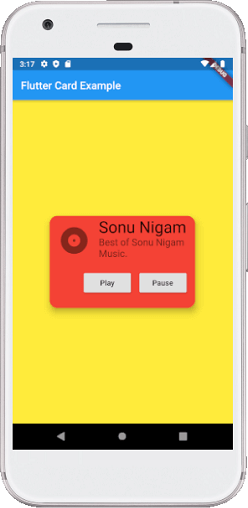
In this example, we will create a card widget that shows the album information and two actions named Play and Pause. Create a project in the IDE, open the main.dart file and replace it with the following code.
import 'package:flutter/material.dart';

void main() => runApp(MyApp());

/// This Widget is the main application widget.
class MyApp extends StatelessWidget {
  @override
  Widget build(BuildContext context) {
    return MaterialApp(
      home: Scaffold(
        appBar: AppBar(title: Text('Flutter Card Example')),
        backgroundColor: Colors.yellow,
        body: MyCardWidget(),
      ),
    );
  }
}

/// This is the stateless widget that the main application instantiates.
class MyCardWidget extends StatelessWidget {
  MyCardWidget({Key key}) : super(key: key);

  @override
  Widget build(BuildContext context) {
    return Center(
      child: Container(
        width: 300,
        height: 200,
        padding: new EdgeInsets.all(10.0),
        child: Card(
          shape: RoundedRectangleBorder(
            borderRadius: BorderRadius.circular(15.0),
          ),
          color: Colors.red,
          elevation: 10,
          child: Column(
            mainAxisSize: MainAxisSize.min,
            children: < Widget>[
              const ListTile(
                leading: Icon(Icons.album, size: 60),
                title: Text(
                  'Sonu Nigam',
                  style: TextStyle(fontSize: 30.0)
                ),
                subtitle: Text(
                  'Best of Sonu Nigam Music.',
                  style: TextStyle(fontSize: 18.0)
                ),
              ),
              ButtonBar(
                children: < Widget>[
                  RaisedButton(
                    child: const Text('Play'),
                    onPressed: () {/* ... */},
                  ),
                  RaisedButton(
                    child: const Text('Pause'),
                    onPressed: () {/* ... */},
                  ),
                ],
              ),
            ],
          ),
        ),
      )
    );
  }
}
Output:
When we run this app, it will show the UI of the screen as below screenshot.