Theoretical Paper
- Computer Organization
- Data Structure
- Digital Electronics
- Object Oriented Programming
- Discrete Mathematics
- Graph Theory
- Operating Systems
- Software Engineering
- Computer Graphics
- Database Management System
- Operation Research
- Computer Networking
- Image Processing
- Internet Technologies
- Micro Processor
- E-Commerce & ERP
- Dart Programming
- Flutter Tutorial
- Numerical Methods Tutorials
- Flutter Tutorials
Practical Paper
Industrial Training

Flutter Widgets
In this section, we are going to learn the concept of a widget, how to create it, and their different types available in the Flutter framework. We have learned earlier that everything in Flutter is a widget.
If you are familiar with React or Vue.js, then it is easy to understand the Flutter.
Whenever you are going to code for building anything in Flutter, it will be inside a widget. The central purpose is to build the app out of widgets. It describes how your app view should look like with their current configuration and state. When you made any alteration in the code, the widget rebuilds its description by calculating the difference of previous and current widget to determine the minimal changes for rendering in UI of the app.
Widgets are nested with each other to build the app. It means the root of your app is itself a widget, and all the way down is a widget also. For example, a widget can display something, can define design, can handle interaction, etc.
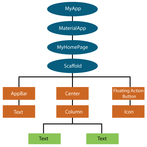
The below image is a simple visual representation of the widget tree.
We can create the Flutter widget like this:
Class ImageWidget extends StatelessWidget {
         // Class Stuff
}
Hello World Example
import 'package:flutter/material.dart';

class MyHomePage extends StatelessWidget {
  MyHomePage({Key key, this.title}) : super(key: key);
  // This widget is the home page of your application.
  final String title;

  @override
  Widget build(BuildContext context) {
    return Scaffold(
      appBar: AppBar(
        title: Text(this.title),
      ),
      body: Center(
        child: Text('Hello World'),
      ),
    );
  }
}
Types of Widget
We can split the Flutter widget into two categories:
- Visible (Output and Input)
- Invisible (Layout and Control)
Visible widget
The visible widgets are related to the user input and output data. Some of the important types of this widget are:
Text
A Text widget holds some text to display on the screen. We can align the text widget by using textAlign property, and style property allow the customization of Text that includes font, font weight, font style, letter spacing, color, and many more. We can use it as like below code snippets.
new Text(
'Hello, Javatpoint!',
textAlign: TextAlign.center,
style: new TextStyle(fontWeight: FontWeight.bold),
)
Button
This widget allows you to perform some action on click. Flutter does not allow you to use the Button widget directly; instead, it uses a type of buttons like a FlatButton and a RaisedButton. We can use it as like below code snippets.
//FlatButton Example
new FlatButton(
  child: Text("Click here"),
  onPressed: () {
    // Do something here
  },
),

//RaisedButton Example
new RaisedButton(
  child: Text("Click here"),
  elevation: 5.0,
  onPressed: () {
    // Do something here
  },
),
In the above example, the onPressed property allows us to perform an action when you click the button, and elevation property is used to change how much it stands out.
Image
This widget holds the image which can fetch it from multiple sources like from the asset folder or directly from the URL. It provides many constructors for loading image, which are given below:
- Image: It is a generic image loader, which is used by ImageProvider.
- asset: It load image from your project asset folder.
- file: It loads images from the system folder.
- memory: It load image from memory.
- network: It loads images from the network.
To add an image in the project, you need first to create an assets folder where you keep your images and then add the below line in pubspec.yaml file.
assets:
  - assets/
Now, add the following line in the dart file.
Image.asset('assets/computer.png')
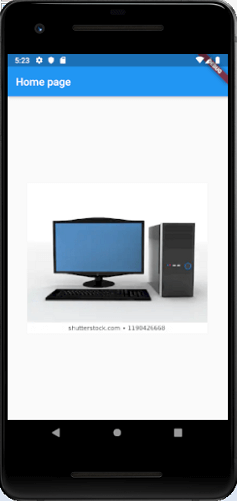
The complete source code for adding an image is shown below in the hello world example.
class MyHomePage extends StatelessWidget {
  MyHomePage({Key key, this.title}) : super(key: key);
  // This widget is the home page of your application.
  final String title;

  @override
  Widget build(BuildContext context) {
    return Scaffold(
      appBar: AppBar(
        title: Text(this.title),
      ),
      body: Center(
        child: Image.asset('assets/computer.png'),
      ),
    );
  }
}
When you run the app, it will give the following output.
Icon
This widget acts as a container for storing the Icon in the Flutter. The following code explains it more clearly.
new Icon(
  Icons.add,
  size: 34.0,
)
Invisible widget
The invisible widgets are related to the layout and control of widgets. It provides controlling how the widgets actually behave and how they will look onto the screen. Some of the important types of these widgets are:
Column
A column widget is a type of widget that arranges all its children's widgets in a vertical alignment. It provides spacing between the widgets by using the mainAxisAlignment and crossAxisAlignment properties. In these properties, the main axis is the vertical axis, and the cross axis is the horizontal axis.
Example
The below code snippets construct two widget elements vertically.
new Column( mainAxisAlignment: MainAxisAlignment.center, children:[ new Text( "VegElement", ), new Text( "Non-vegElement" ), ], ),
Row
The row widget is similar to the column widget, but it constructs a widget horizontally rather than vertically. Here, the main axis is the horizontal axis, and the cross axis is the vertical axis.
Example
The below code snippets construct two widget elements horizontally.
new Row(
  mainAxisAlignment: MainAxisAlignment.spaceEvenly,
  children: < Widget>[
    new Text(
      "VegElement",
    ),
    new Text(
      "Non-vegElement"
    ),
  ],
),
Center
This widget is used to center the child widget, which comes inside it. All the previous examples contain inside the center widget.
Example
Center(
  child: new clumn(
    mainAxisAlignment: MainAxisAlignment.spaceEvenly,
    children: [
      new Text(
         "VegElement",
      ),
      new Text(
         "Non-vegElement"
      ),
    ],
  ),
),
Padding
This widget wraps other widgets to give them padding in specified directions. You can also provide padding in all directions. We can understand it from the below example that gives the text widget padding of 6.0 in all directions.
Example
Padding(
  padding: const EdgeInsets.all(6.0),
  child: new Text(
    "Element 1",
  ),
),
Scaffold
This widget provides a framework that allows you to add common material design elements like AppBar, Floating Action Buttons, Drawers, etc.
Stack
It is an essential widget, which is mainly used for overlapping a widget, such as a button on a background gradient.
State Management Widget
In Flutter, there are mainly two types of widget:
- StatelessWidget
- StatefulWidget
StatefulWidget
A StatefulWidget has state information. It contains mainly two classes: the state object and the widget. It is dynamic because it can change the inner data during the widget lifetime. This widget does not have a build() method. It has createState() method, which returns a class that extends the Flutters State Class. The examples of the StatefulWidget are Checkbox, Radio, Slider, InkWell, Form, and TextField.
Example
class Car extends StatefulWidget {
  const Car({ Key key, this.title }) : super(key: key);

  @override
  _CarState createState() => _CarState();
}

class _CarState extends State < Car> {
  @override
  Widget build(BuildContext context) {
    return Container(
      color: const Color(0xFEEFE),
           child: Container(
            child: Container( //child: Container() )
        )
    );
  }
}
StatelessWidget
The StatelessWidget does not have any state information. It remains static throughout its lifecycle. The examples of the StatelessWidget are Text, Row, Column, Container, etc.
Example
class MyStatelessCarWidget extends StatelessWidget {
  const MyStatelessCarWidget ({ Key key }) : super(key: key);

  @override
  Widget build(BuildContext context) {
    return Container(color: const Color(0x0xFEEFE));
  }
}