Theoretical Paper
- Computer Organization
- Data Structure
- Digital Electronics
- Object Oriented Programming
- Discrete Mathematics
- Graph Theory
- Operating Systems
- Software Engineering
- Computer Graphics
- Database Management System
- Operation Research
- Computer Networking
- Image Processing
- Internet Technologies
- Micro Processor
- E-Commerce & ERP
- Dart Programming
- Flutter Tutorial
- Numerical Methods Tutorials
- Flutter Tutorials
Practical Paper
Industrial Training

Flutter Slivers
Sliver is a portion of the scrollable area which is used to achieve a custom scrolling effect. In other words, the sliver widget is a slice of the viewport. We can implement all of the scrollable views, such as ListView, GridView using slivers. It is a lower-level interface that provides excellent control over implementing a scrollable area. It is useful while scrolling large numbers of children widgets in a scrollable area. As they are based on the viewport, it can change their shape, size, and extent based on several events and offset.
Flutter provides several kinds of slivers, some of them are given below:
- SliverAppBar
- SliverList
- SliverGrid
How to use slivers?
It is to note that all of the sliver's components should always be placed inside a CustomScrollView. After that, we can combine the list of slivers to make the custom scrollable area.
What is CustomScrollView?
CustomScrollView in Flutter is a scroll view that allows us to create various scrolling effects such as grids, lists, and expanding headers. It has a sliver property where we can pass a list of widgets that include SliverAppBar, SliverToBoxAdapter, SliverList, and SliverGrid, etc.
Let us discuss each sliver in detail.
SliverAppBar
SliverAppBar is a material design app bar in Flutter that integrates with a CustomScrollView. Generally, we used it as the first child of CustomScrollView. It can vary in height and float above the other widget of the scroll view. It allows us to create an app bar with various scrolling effects.
Properties of SliverAppBar
The following are the essential properties of the SliverAppBar:
actions: This property is used to create widgets right of the appBar title. Generally, it is an iconButton that represents common operations.
title: This property is used to define the title to the SliverAppBar. It is similar to the AppBar title to give the name of the application.
leading: This property is used to define a widget left to the title. Generally, it is used to place the Menu Drawer widget.
backgroundColor: This property is used to define a background color to the sliver app bar.
bottom: This property is used to create space to the bottom of the title, where we can define any widget according to our needs.
expandedHeight: This property is used to specify the maximum height to the app bar that can be expanded while scrolling. It must be defined in a double value.
floating: This property determines whether the app bar will be visible or not when the user scrolls towards the app bar.
flexibleSpace: This property is used to define a widget which is stacked behind the toolbar and the tab bar. Its height is the same as the app bar's overall height.
Example
In the below example, we will see how to use the SliverAppBar with CustomScrollView.
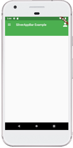
import 'package:flutter/material.dart';

void main() => runApp(MyApp());

class MyApp extends StatelessWidget {
  @override
  Widget build(BuildContext context) {
    return MaterialApp(
      home: Scaffold(
        body: CustomScrollView(
          slivers:  < Widget>[
            SliverAppBar(
              actions: < Widget>[
                Icon(Icons.person, size: 40,)
            ],
              title: Text("SliverAppBar Example"),
              leading: Icon(Icons.menu),
              backgroundColor: Colors.green,
              expandedHeight: 100.0,
              floating: true,
              pinned: true
            )
            // Place sliver widgets here
          ],
        ),
      ),
    );
  }
}
Output
When we run the app, we should get the UI of the screen similar to the below screenshot:
SliverList
SliverList is a sliver that places the children in a linear array or one-dimensional array. It takes a delegate parameter to provide the items in the list in a way they will scroll into view. We can specify the children's list using a SliverChildListDelegate or build them with a SliverChildBuilderDelegate.
Example
In the below example, we will see how to use the SliverList with CustomScrollView.
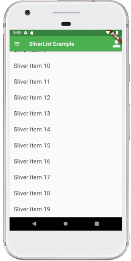
import 'package:flutter/material.dart';

void main() => runApp(MyApp());

class MyApp extends StatelessWidget {
  @override
  Widget build(BuildContext context) {
    return MaterialApp(
      home: Scaffold(
        body: CustomScrollView(
          slivers: < Widget>[
            SliverAppBar(
              actions: < Widget>[
                Icon(Icons.person, size: 40,)
            ],
              title: Text("SliverList Example"),
              leading: Icon(Icons.menu),
              backgroundColor: Colors.green,
              expandedHeight: 100.0,
              floating: true,
              pinned: true
            ),
            SliverList(
              delegate: new SliverChildListDelegate(_buildList(20)),
            ),// Place sliver widgets here
          ],
        ),
      ),
    );
  }
}
List _buildList(int count) {
  List< Widget> listItems = List();
  for (int i = 0; i < count; i++) {
    listItems.add(new Padding(padding: new EdgeInsets.all(16.0),
        child: new Text(
            'Sliver Item ${i.toString()}',
            style: new TextStyle(fontSize: 22.0)
        )
    ));
  }
  return listItems;
}
Output
When we run the app, we should get the UI of the screen similar to the below screenshot:
SliverGrid
SliverGrids places the children in a two-dimensional arrangement. It also uses a delegate to specify the children or an explicit list similar to the SliverList. But it has additional formatting to the cross-axis dimension on a grid. It allows the three ways to specify the grid layout:
1. It uses Count Constructor for counting the number of items in the horizontal axis. See the below code:
SliverGrid.count( crossAxisCount: 3, mainAxisSpacing: 20.0, crossAxisSpacing: 20.0, childAspectRatio: 3.0, children:[ Container(color: Colors.red), Container(color: Colors.blue), Container(color: Colors.green), Container(color: Colors.red), Container(color: Colors.blue), Container(color: Colors.green), ], ),
2. It uses Extent Constructor, which specifies the maximum width of the items. It is most useful when the grid items vary in size. It means we can limit how large space they should take up. See the below code:
SliverGrid.extent( maxCrossAxisExtent: 200, mainAxisSpacing: 10.0, crossAxisSpacing: 10.0, childAspectRatio: 4.0, children:[ Container(color: Colors.orange), Container(color: Colors.yellow), Container(color: Colors.purple), Container(color: Colors.pink), Container(color: Colors.green), Container(color: Colors.indigo), ], ),
3. It uses Default constructor which is pass in an explicit gridDelegate parameter:
Example
In the below example, we will see how to use the SliverGrid with CustomScrollView.
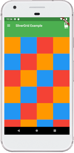
import 'package:flutter/material.dart'; void main() => runApp(MyApp()); class MyApp extends StatelessWidget { @override Widget build(BuildContext context) { return MaterialApp( home: Scaffold( body: CustomScrollView( slivers:[ SliverAppBar( actions: [ Icon(Icons.camera_front, size: 40,) ], title: Text("SliverGrid Example"), leading: Icon(Icons.menu), backgroundColor: Colors.green, expandedHeight: 100.0, floating: true, pinned: true ), SliverGrid( gridDelegate: SliverGridDelegateWithFixedCrossAxisCount( crossAxisCount: 4, ) , delegate: SliverChildBuilderDelegate((BuildContext context, int index) { return new Container( color: _randomPaint(index), height: 150.0 ); }), ), ], ), ), ); } } Color _randomPaint(int index) { if (index % 3 == 0) { return Colors.orange; } else if (index % 3 == 1) { return Colors.blue; } return Colors.red; }
Output
When we run the app, we should get the UI of the screen similar to the below screenshot:
SliverFixedExtentList and SliverToBoxAdapter
A SliverFixedExtentList is a sliver that holds multiple children with the same main-axis extent in a one-dimensional array or linear array. It is more efficient than SliverList because there is no need to perform layouts on its children to obtain the main-axis extent. It does not allow a gap between its children. It requires each child to have the SliverConstraints.crossAxisExtent in the cross axis and the itemExtent property on the main-axis.
A SliverToBoxAdapter is a sliver that can hold only a single box widget. It is useful when we want to display only a single child widget in CustomScrollView to create a custom scroll effect. If we need to display multiple box widgets in a CustomScrollView, we must use the SliverList, SliverFixedExtentList, or SliverGrid.
Example
In the below example, we will see how to use the SliverFixedExtentList and SliverToBoxAdapter with CustomScrollView.
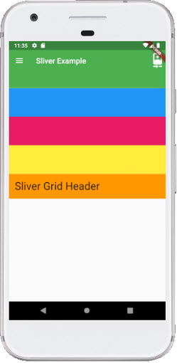
import 'package:flutter/material.dart'; void main() => runApp(MyApp()); class MyApp extends StatelessWidget { @override Widget build(BuildContext context) { return MaterialApp( home: Scaffold( body: CustomScrollView( slivers:[ SliverAppBar( actions: [ Icon(Icons.camera_front, size: 40,) ], title: Text("Sliver Example"), leading: Icon(Icons.menu), backgroundColor: Colors.green, expandedHeight: 100.0, floating: true, pinned: true ), SliverFixedExtentList( itemExtent: 75, delegate: SliverChildListDelegate([ Container(color: Colors.blue), Container(color: Colors.pink), Container(color: Colors.yellow), ]), ), SliverToBoxAdapter( child: Container( color: Colors.orange, padding: const EdgeInsets.all(16.0), child: Text('Sliver Grid Header', style: TextStyle(fontSize: 28)), ), ), ], ), ), ); } }
Output
When we run the app, we should get the UI of the screen similar to the below screenshot: