Theoretical Paper
- Computer Organization
- Data Structure
- Digital Electronics
- Object Oriented Programming
- Discrete Mathematics
- Graph Theory
- Operating Systems
- Software Engineering
- Computer Graphics
- Database Management System
- Operation Research
- Computer Networking
- Image Processing
- Internet Technologies
- Micro Processor
- E-Commerce & ERP
- Dart Programming
- Flutter Tutorial
- Numerical Methods Tutorials
- Flutter Tutorials
Practical Paper
Industrial Training

Flutter AlertDialog
An alert dialog is a useful feature that notifies the user with important information to make a decision or provide the ability to choose a specific action or list of actions. It is a pop-up box that appears at the top of the app content and the middle of the screen. It can be dismissed manually by the user before resuming interaction with the app.
An alert can be thought of as a floating modal which should be used for a quick response such as password verification, small app notifications, and many more. The alerts are very flexible and can be customized very easily.
In Flutter, the AlertDialog is a widget, which informs the user about the situations that need acknowledgment. The Flutter alert dialog contains an optional title that displayed above the content and list of actions displayed below the content.
Properties of Alert Dialog
The main properties of the AlertDialog widget are:
Title: This property gives the title to an AlertDialog box that occupies at the top of the AlertDialog. It is always good to keep the title as short as possible so that the user knows about its use very easily. We can write the title in AlertDialog as below:
AlertDialog(title: Text("Sample Alert Dialog"),
Action: It displays below the content. For example, if there is a need to create a button to choose yes or no, then it is defined in the action property only. We can write an action attribute in AlertDialog as below:
actions:[ FlatButton(child: Text("Yes"),), FlatButton(child: Text("No"),) ],)
Content: This property defines the body of the AlertDialog widget. It is a type of text, but it can also hold any kind of layout widgets. We can use the Content attribute in AlertDialog as below:
actions: < Widget>[
    FlatButton(child: Text("Yes"),),
    FlatButton(child: Text("No"),)
],)
content: Text("It is the body of the alert Dialog"),
ContentPadding: It gives the padding required for the content inside the AlertDialog widget. We can use ContentPadding attribute in AlertDialog as below:
contentPadding: EdgeInsets.all(32.0),
Shape: This attribute provides the shape to the alert dialog box, such as curve, circle, or any other different shape.
shape: CircleBorder(),
shape: CurveBorder(),
We can categories the alert dialog into multiple types, which are given below:
- Basic AlertDialog
- Confirmation AlertDialog
- Select AlertDialog
- TextField AlertDialog
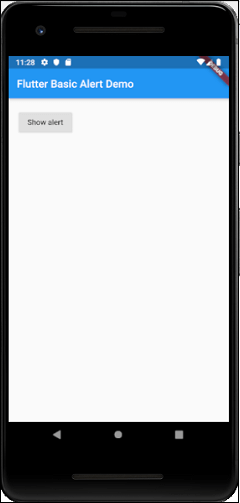
Basic AlertDialog
This alert notifies the users about new information, such as a change in the app, about new features, an urgent situation that requires acknowledgment, or as a confirmation notification to the user that an action was successful or not. The following example explains the use of basic alerts.
Example
Create a Flutter project in Android Studio and replace the following code with main.dart file. To show an alert, you must have to call showDialog() function, which contains the context and itemBuilder function. The itemBuilder function returns an object of type dialog, the AlertDialog.
import 'package:flutter/material.dart';

void main() => runApp(MyApp());

class MyApp extends StatelessWidget {
  @override
  Widget build(BuildContext context) {
    final appTitle = 'Flutter Basic Alert Demo';
    return MaterialApp(
      title: appTitle,
      home: Scaffold(
        appBar: AppBar(
          title: Text(appTitle),
        ),
        body: MyAlert(),
      ),
    );
  }
}

class MyAlert extends StatelessWidget {
  @override
  Widget build(BuildContext context) {
    return Padding(
      padding: const EdgeInsets.all(20.0),
      child: RaisedButton(
        child: Text('Show alert'),
        onPressed: () {
          showAlertDialog(context);
        },
      ),
    );
  }
}

showAlertDialog(BuildContext context) {
  // Create button
  Widget okButton = FlatButton(
    child: Text("OK"),
    onPressed: () {
      Navigator.of(context).pop();
    },
  );

  // Create AlertDialog
  AlertDialog alert = AlertDialog(
    title: Text("Simple Alert"),
    content: Text("This is an alert message."),
    actions: [
      okButton,
    ],
  );

  // show the dialog
  showDialog(
    context: context,
    builder: (BuildContext context) {
      return alert;
    },
  );
}
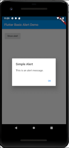
Output
Now, run the app, it will give the following output. When you click on the button Show Alert, you will get the alert message.
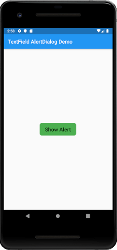
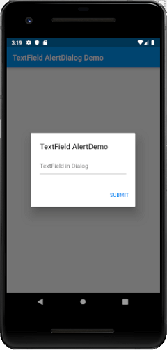
TextField AlertDialog
This AlertDialog makes it able to accept user input. In the following example, we are going to add text field input in the alert dialog. Open the main.dart file and insert the following code.
import 'package:flutter/material.dart';

void main() => runApp(MyApp());

class MyApp extends StatelessWidget {
  // This widget is the root of your application.
  @override
  Widget build(BuildContext context) {
    return MaterialApp(
      title: 'Flutter Alert Demo',
      debugShowCheckedModeBanner: false,
      theme: ThemeData(
        primarySwatch: Colors.blue,
      ),
      //home: MyHomePage(title: 'Flutter Demo Home Page'),
      home: TextFieldAlertDialog(),
    );
  }
}
class TextFieldAlertDialog extends StatelessWidget {
  TextEditingController _textFieldController = TextEditingController();

  _displayDialog(BuildContext context) async {
    return showDialog(
        context: context,
        builder: (context) {
          return AlertDialog(
            title: Text('TextField AlertDemo'),
            content: TextField(
              controller: _textFieldController,
              decoration: InputDecoration(hintText: "TextField in Dialog"),
            ),
            actions: < Widget>[
              new FlatButton(
                child: new Text('SUBMIT'),
                onPressed: () {
                  Navigator.of(context).pop();
                },
              )
            ],
          );
        });
  }

  @override
  Widget build(BuildContext context) {
    return Scaffold(
      appBar: AppBar(
        title: Text('TextField AlertDialog Demo'),
      ),
      body: Center(
        child: FlatButton(
          child: Text(
            'Show Alert',
            style: TextStyle(fontSize: 20.0),),
            padding: EdgeInsets.fromLTRB(20.0,12.0,20.0,12.0),
            shape: RoundedRectangleBorder(
              borderRadius: BorderRadius.circular(8.0)
            ),
          color: Colors.green,
          onPressed: () => _displayDialog(context),
        ),
      ),
    );
  }
}
Output
Now, run the app, it will give the following output. When you click on the button Show Alert, you will get the text input alert message.
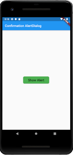
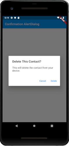
Confirmation AlertDialog
The confirmation alert dialog notifies a user to confirm a particular choice before moving forward in the application. For example, when a user wants to delete or remove a contact from the address book.
Example
import 'package:flutter/material.dart';

void main() {
  runApp(new MaterialApp(home: new MyApp()));
}

class MyApp extends StatelessWidget {
  // This widget is the root of your application.
  @override
  Widget build(BuildContext context) {
    // TODO: implement build
    return new Scaffold(
      appBar: AppBar(
        title: Text("Confirmation AlertDialog"),
      ),
      body: Center(
        child: Column(
          mainAxisAlignment: MainAxisAlignment.center,
          children: < Widget>[
            new RaisedButton(
              onPressed: () async {
                final ConfirmAction action = await _asyncConfirmDialog(context);
                print("Confirm Action $action" );
              },
              child: const Text(
                "Show Alert",
                style: TextStyle(fontSize: 20.0),),
                padding: EdgeInsets.fromLTRB(30.0,10.0,30.0,10.0),
                shape: RoundedRectangleBorder(
                  borderRadius: BorderRadius.circular(8.0)
                ),
                color: Colors.green,
              ),
          ],
        ),
      ),
    );
  }
}
enum ConfirmAction { Cancel, Accept}
Future< ConfirmAction> _asyncConfirmDialog(BuildContext context) async {
  return showDialog< ConfirmAction>(
    context: context,
    barrierDismissible: false, // user must tap button for close dialog!
    builder: (BuildContext context) {
      return AlertDialog(
        title: Text('Delete This Contact?'),
        content: const Text(
            'This will delete the contact from your device.'),
        actions: < Widget>[
          FlatButton(
            child: const Text('Cancel'),
            onPressed: () {
              Navigator.of(context).pop(ConfirmAction.Cancel);
            },
          ),
          FlatButton(
            child: const Text('Delete'),
            onPressed: () {
              Navigator.of(context).pop(ConfirmAction.Accept);
            },
          )
        ],
      );
    },
  );
}
Output
Now, run the app, it will give the following output. When you click on the button Show Alert, you will get the alert message.
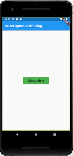
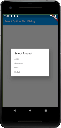
Select Option AlertDialog
This type of alert dialog displays the list of items, which takes immediate action when selected.
Example
import 'package:flutter/material.dart';

void main() {
  runApp(new MaterialApp(home: new MyApp()));
}

class MyApp extends StatelessWidget {
  // This widget is the root of your application.
  @override
  Widget build(BuildContext context) {
    // TODO: implement build
    return new Scaffold(
      appBar: AppBar(
        title: Text("Select Option AlertDialog"),
      ),
      body: Center(
        child: Column(
          mainAxisAlignment: MainAxisAlignment.center,
          children: < Widget>[
            new RaisedButton(
              onPressed: () async {
                final Product prodName = await _asyncSimpleDialog(context);
                print("Selected Product is $prodName");
              },
              child: const Text(
                "Show Alert",
                style: TextStyle(fontSize: 20.0),),
                padding: EdgeInsets.fromLTRB(30.0,10.0,30.0,10.0),
                shape: RoundedRectangleBorder(
                  borderRadius: BorderRadius.circular(8.0)
                ),
                color: Colors.green,
              ),
          ],
        ),
      ),
    );
  }
}
enum Product { Apple, Samsung, Oppo, Redmi }

Future< Product> _asyncSimpleDialog(BuildContext context) async {
  return await showDialog< Product>(
      context: context,
      barrierDismissible: true,
      builder: (BuildContext context) {
        return SimpleDialog(
          title: const Text('Select Product '),
          children: < Widget>[
            SimpleDialogOption(
              onPressed: () {
                Navigator.pop(context, Product.Apple);
              },
              child: const Text('Apple'),
            ),
            SimpleDialogOption(
              onPressed: () {
                Navigator.pop(context, Product.Samsung);
              },
              child: const Text('Samsung'),
            ),
            SimpleDialogOption(
              onPressed: () {
                Navigator.pop(context, Product.Oppo);
              },
              child: const Text('Oppo'),
            ),
            SimpleDialogOption(
              onPressed: () {
                Navigator.pop(context, Product.Redmi);
              },
              child: const Text('Redmi'),
            ),
          ],
        );
      });
}
Output
When you run the app, it will give the following output. Now, click on the button Show Alert, you will get the select option alert box message. As soon as you select any of the available options, the alert message disappears, and you will get a message of the selected choice in the console.